I’LL TAKE IT NEAT: THIS AIN’T YOUR DADDY’S GIN
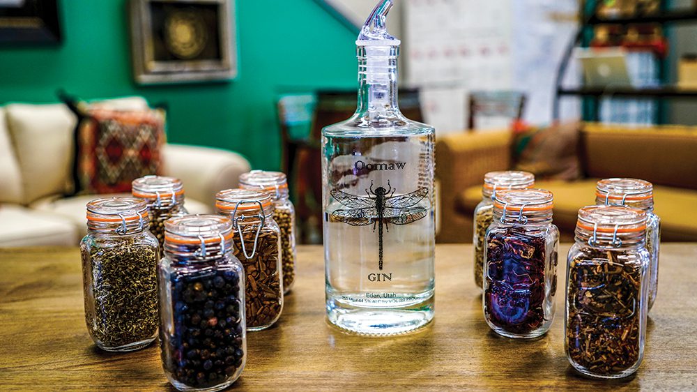

words and photos by: Andrea Peterson First it was beer, then it was wine. Now the world…
adminAugust 2, 2017