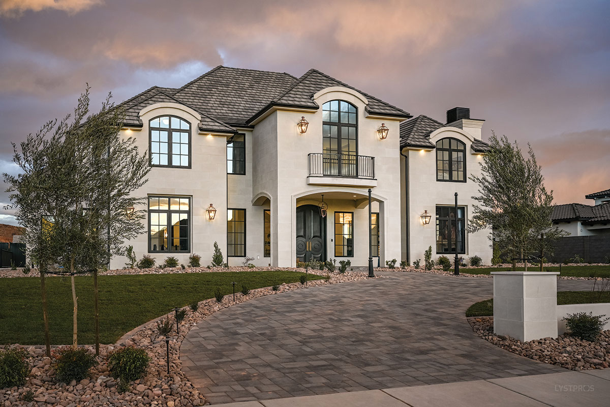
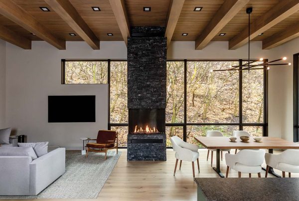
A large St. George home deftly integrates family-friendly spaces with a lively mix of traditional and contemporary styles.
Looks, it is said, can be deceiving. Take this newly built home in St. George, for example. From the outside, its grand scale and symmetrical facade suggests a buttoned-up, stand-at-attention décor waiting inside the stately entry. Instead, a surprising mix of fresh traditional and laid-back contemporary styles defines the interior, delivering a relaxed, gracious look and livability that flows throughout.


The owners—a couple with five children— enlisted contractor Rob Wyman to build the home, architectural designer Shawn Patten to imagine it and interior designers Yvonne Christensen and Nichole Speirs to fashion and furnish its décor. After meeting with the clients, Patten, principal of Creative Dimensions, set to work drafting the large family home. “The owners wanted something a bit different for St. George,” says Patten, referencing the home’s traditional manor style and formal facade featuring a prominent entry. Inside, spacious rooms, a flowing floor plan and loads of natural light elevate his design. A great room, kitchen and master suite reside on the main floor along with a dazzling central hallway, kids’ study, and dining, guest and music rooms. The kids’ bedrooms and play loft occupy the second level, while a must-have indoor volleyball court, theater and enormous garage fill the lower level beneath the house. “They wanted to hide the visibility of the garage’s bulk and doors,” Patten explains.

To play off the sunlight flowing through large windows and massive double doors, Christensen and Speirs fashioned a predominantly light-walled interior. With this luminous backdrop in place, they brought on the character. The duo peppered the interior with dramatic darks: window frames, a fluted TV wall, kitchen cabinets, bathroom walls, doors and shapely furnishings all chicly dressed in shades of black. “Our client loves high contrast,” Christensen explains.


Large-scale, black-and-white check floors in the kids’ study, laundry room and boys’ bath further tone-driven tension while celebrating the classic, checkerboard pattern. “We repeated this flooring to help create a sense of continuity in the design, which is particularly important in a large home,” Speirs says. To her point, jewelry-like lighting, playful art, reeded cabinetry and a curated mix of rounded and angular forms similarly replay, performing like threads that tie the home’s spaces together.

The large interior is heavy with heroes. Take the central hallway, for example. “From the start, our clients wanted a long, groin-vaulted hallway,” Patten says. He responded with a wide, 45-foot-long passage linking the great room and primary suite. Arched double doors line up like soldiers beneath the numerous vaults, filling the space with natural light and views of the patios and pool. The designers hung a group of faceted lanterns from the ceiling, and below, they created an intricately patterned floor crafted from white oak. “This space is the jewel of the home,” Speirs says.


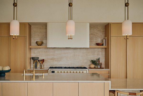
The great room similarly delights with its chic, high-contrast kitchen outfitted with multiple prep stations, double islands and chic, brass-banded lighting. “We added extra pendant lights to give the space a beautiful glow,” Christensen says. In the nearby conversation area, a black reeded wall disguises the dark screen of a wall-mounted TV while creating a striking backdrop for a contemporary, leather-strip chandelier. Behind the wall, a separate lounge area for the kids keeps their action front and center. “Our clients didn’t want visitors upstairs, so they put the kids’ play and study spaces on the main level,” the designer explains.

Equally compelling, the music room gets a moody vibe courtesy of dark blue walls and a ceiling dressed in Kelly Wearstler wallpaper. “We wanted the room to feel cozy and inviting,” Speirs says. Layered lighting plays a part, with a halo-like chandelier floating above a sitting area and art lights illuminating books uniquely displayed on inclined shelves set inside a wall of built-ins. “It’s a cleaner and more decorative way to display open books,” Christensen explains.


Innovative details thrive in the primary suite as well. There, black double doors open to a cozy sitting area, smart glass behind the tub switches the window from transparent to opaque behind the tub, and the wife’s sleek workspace is cleverly set behind glass doors just steps from the bed. “The owner wanted her desk area in the bedroom rather than in a dedicated office space,” Speirs says.

Together, all of the home’s spaces delivered exactly what the owners had hoped for. In fact, Christensen explains, their clients had compiled a wish list for their perfect home years ago and found these old notes midway through the building process. They couldn’t have been more delighted. “It was a real moment of gratitude when they realized the home they had always dreamt of had come to fruition,” she says.

Take more House Tours here.

