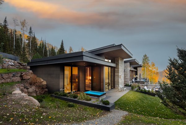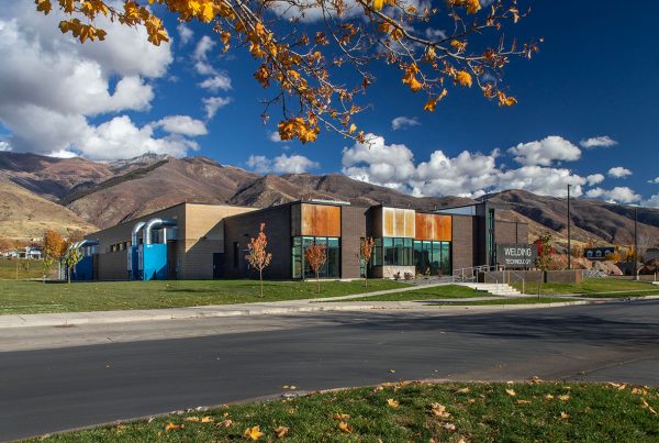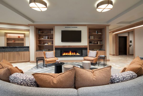


Modern mountain design seems to have found its place in the Wasatch: durable stone inside and out; steel beams to carry the broad expanses needed for window walls, open floor plans, and disappearing doors; glass to connect the home with the surrounding beauty and views; metal accents and wood to add a natural warmth and mountain tradition. More and more it has become the norm, and homes are experimenting and pushing design forward in new directions.
I recently photographed such a home in Victory Ranch, a private development at the southeast end of the Jordanelle Reservoir with views to the Provo River, beautiful rock cliffs and the Deer Valley Resort and Wasatch Range. Upwall Design (Mike Upwall) was the architect, Kent Construction (Jamie Catley) built it and a Chicago firm, Michael Abrams Interiors, completed the interior design. It was Michael Abrams Interiors’ first Utah mountain home, and Michael Abrams and his associate Gina Valenti approached it by adding an inviting softness through the use of fabrics, ample cushions, subtle curves, and subdued color.
The entry with its big swinging pivot door serves the same function as an introduction in a musical piece. Through the glass you can see the mountains in the distance; the slanted roof continues from the front, through the home, and out the back patio and introduces the stone, wood, and metal of the material palette.
The open floor plan unfolds from the view from the doorway. The ceiling and floor treatments remain consistent through the open plan. The angled windows architecturally define some of the space, and Abrams and Valenti use thick sculpted area carpets to define the seating areas.
Focusing just on the main living area and looking back to the fireplace again offers a view to the continuation of the stone wall to a fin outside that frames the patio seating, as well as the continuation or the wooden ceiling. The flooring appears to continue outside, but there is a shift from wood to wood-appearing ceramic tile. The colorful stone inspires the colors in the furnishings. The furnishings also pick up the rectangular elements of the architecture, as does the dimensionally sculpted carpet.
Gina Valenti calls exquisite details ‘moments.’ I have a separate camera for photographing details, and now I call it my ‘moment’ camera in her honor.
Continuing on the main floor is the master bedroom. The tactile fibers include angora and cashmere. Softening this room are drapes, area carpet, and the upholstered bed set. Here again, design elements echo the rectangular architectural elements but also offset it with curves in the headboard, chandelier, and the corner chair.
Adjacent to the master is the home office with a rustic feel set by the reclaimed wood and echoed by the artwork, accessories, and the brass nails in the sofa and coffee table.
The use of ample fabrics and textures continues to the lower level’s family room. The same stone repeats and again influences the colors for the furnishings. An interesting touch is the steel doorframe leading into the game room.
The weather was cloudy both days I photographed despite the forecasts for clear blue skies. The diffused light reflected by the snow on the ground benefitted the interiors by getting truer color with minimal lights on in the home.
The weather inspired me to experiment with black and white photos of the master bath. It looks cold outside and was, which makes taking photos inside all the better. Look for exteriors of the home when the weather warms and the sky turns blue.
See more Photo Friday here!


