A hillside site inspires a Park City home’s design, defined by dynamic architecture and a compelling, clean-lined décor.

Homeowners Vince and Teresa Criscione.

On the back deck, the floating hearth of a corner fireplace juts from a stone monolith shared by the great room where a twin fireplace resides inside. Floor-to-ceiling angled windows capture mountain and golf course views from cantilevered interior spaces that include the great room, office and master suite.
If ever there were a home that takes advantage of its site, it’s the Park City residence architect Michael Upwall designed for homeowners Vince and Teresa Criscione. Located in the Glenwild community, this decidedly contemporary structure—clad in light-toned cedar—sits high on its hillside property. The house looks deeply rooted to the land on its entry side, yet poised to take flight on the back, as cantilevered sections jut out toward the mountains and golf course below. “The design is definitely site-driven,” says Vince, who performed as the general contractor for the project. “We wanted it to be one with the side of the mountain.”

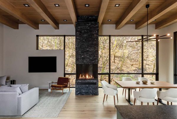
European white oak floors span the great room where white walls and ceilings allow the dynamic architecture to take center stage. Santa & Cole pendant lights crown a dining table surrounded by B&B Italia chairs. A custom sofa by Baker sits on a wool rug from Regency Royal.
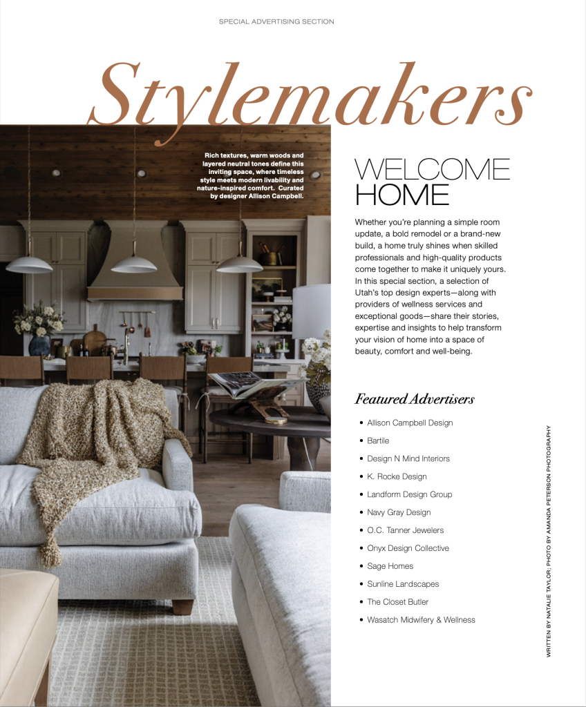
When guests approach the home from its long, steep driveway, they enter a motor court framed by the house and an attached four-door garage. The large garage hunkers into the mountainside to downplay its presence. “We wanted to prioritize the human factor into the arrival, and sometimes garages can challenge that intimate entry experience,” says Upwall. The architect added “lantern-like” translucent glass garage doors and an outdoor fireplace at the front door to serve as glowing, welcoming gestures. “It’s about a sense of arrival, the first experience” he says.

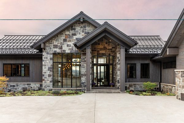
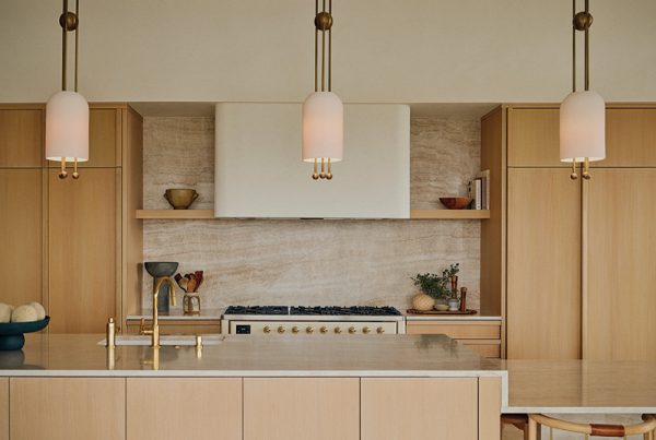
The entertainment-oriented Poliform kitchen features double islands of Spessart oak and white, back-painted glass. Artmide pendant lights team with Zanotta barstools, a Herman Miller lacquered table and Gaggenau appliances to furnish the clean-lined contemporary space.
Memorable experiences continue inside a large, pivoting walnut door where light and mountain views flood the cube-shaped entry through expansive walls of glass. There, a massive pillar of stone—one of three that anchor the structure—helps form the entry space and counters the windows with its heroic bulk and scale. “The three monoliths ground the house, allowing the rest of the architecture to spring from them and fly,” Upwall says.
And fly it does.

Framed by angled walls of stone and floor-to-ceiling glass, a bridge-like passage leads from the entry to the great room. A wide set of steps connects the spaces, following the natural rise of the site as the level of the main living area ascends with the land.
The main passageway’s design, for example, soars. Enclosed by the stone pillar on one side and a wall of floor-to-ceiling, angled glass panes on the other, the broad “bridge” feels like a suspended walkway connecting the entry to the great room. “The windows actually lean out,” Upwall explains. “They engage one with the views much more so than if they were just perpendicular.” Angled windows recur throughout the home, creating striking architectural statements while expanding enviable vistas at every turn.

In the master bathroom, angled windows frame a cantilevered space anchored by a Phillip Starck freestanding tub by Duravit. Butterflied marble slabs from Italia Granite perform like art underfoot.
In the light-filled great room, a wood-burning fireplace notches into the corner of a second stone monolith that extends to an adjoining outdoor deck and rises from the lower level through the roof. “We didn’t want the rock to cover walls, we wanted it to be foundational,” Vince says. White walls and ceilings balance the stones’ mass and accentuate the interior’s bold architectural forms. “The architecture is the art of the home,” Theresa says. For that reason, she and Vince teamed with interior designer Dawn Keil to choose clean-lined, contemporary furnishings and fixtures—including those in the spacious kitchen—that, while eye-catching, allow the structure and scenery to prevail. They also edited the decor’s palette to soft, natural materials and a single hue. “Eggplant is the only color except those in the art,” Theresa says.

The view-laden master bedroom cantilevers out about the tops of the landscape’s gambel oaks, creating a tree-house effect. A custom Cumulus pendant hangs above a woven leather bed by McGuire.
This tightly choreographed design unifies the interior spaces and flows naturally into the master suite. There, serene sleeping quarters and a gleaming, marble-floored bathroom feel like they’re floating in air as they overlook the site steeply sloping away from their end of the home. Angled floor-to-ceiling windows fortify the feeling. “We call it the treehouse effect,” Vinnie says.
When the Crisciones aren’t enjoying the breathtaking views from inside the house, they’re living with them on the expansive deck and covered patio located off the great room. These outdoor areas sit level with the sloped mountainside, allowing the couple to easily step onto and connect with their land, where wildlife thrives—from elk to bobcats, moose to owls.

The front of the home sits low on the land while the back stands two-stories tall and reaches out over the landscape. The four-door garage tucks into the mountainside to visually diminish its scale. Landscape design by Pete Gillwald, Land Solutions.
Like its lively site, the house is dynamic. “It’s not static, it’s like a sculpture in mid-flight,” Upwall explains. The structure follows the slope of the land, reaches out to the views, embraces surrounding nature, pulls in light and captivates its owners every day. “Most architecture looks better on paper than in person, but this house is just the opposite,” Theresa says.”It looks better in person, and we love it more and more the longer we live here.”

Palacek’s Beacon pendant hangs above the McGuire table and chairs in an outdoor dining area located outside the great room, just steps from the main deck.

A pair of walnut-framed, velvet upholstered chairs lend a shot of color and modern form to the great room’s light-filled living area.

Inset inside the entry are’as stone pillar, the powder room boasts a Stone Forest limestone vanity, hand-blown glass pendants, a waterfall faucet and walls dressed in Phillip Jeffries grasscloth.

A small fireplace provides visitors with a warm welcome near the front door.
Want to see more? Check out our magazine!
Sources:
Architect: Michael Upwall, Upwall Design Architects, SLC
Interior Design: Dawn Keil, Design Pacific, Inc., Park City, 435-602-9686
Landscape Design: Pete Gilwald, Land Solutions, Park City, 435-901-3716
Contractor: Crisco Development, Park City; Doors: CR Doors & Moulding, Springville
Custom cabinets: Poliform, SLC
European Oak flooring: Richard Marshall Custom Wood Flooring, Los Angeles, Calif.
Carpeting: Regency Royale, SLC


