In Salt Lake City, a team of pros transforms a cramped 1942 cottage into an oasis of open spaces, lush gardens and fresh, contemporary style. Photos by Lindsay Salazar, Styled by Noelle Wright.
Courtney Little felt the squeeze. For years, she and her three children shared her 1942 cottage’s tight living quarters. And even as her kids grew older and began leaving the nest, Little felt her small house needed a big rethink.

“When I bought it in 2013, it was a cute granny house with great energy,” says Little, describing the cottage located in Salt Lake City’s Harvard/Yale neighborhood. But the 3-bedroom, 3-bath home needed an update. In 2020, Little hired builder Brandon Bodell, architectural designer Brad Waltman and interior designer Dorothy Huntsman to focus on the hub of her home—a dark and dated kitchen oddly located in the front of the house. Scope creep swiftly swept in. Once the team began planning the kitchen redo, it became obvious the entire dwelling deserved a remodel. “I decided that if we were going to do this, we might as well go for it,” Little recalls.

The owner’s “Let’s be bold” directive drove the renovation, inside and out. On the main level spanning 2,500 square feet, the home’s awkward gathering areas consisted of an existing kitchen and two oddly sized living and dining spaces. “It was like a bunch of pods,” Bodell recalls. Waltman cleverly reconfigured the floor plan to open and combine these spaces.

The front of the house received an upgrade of several large windows, filling the newly formed living and lounge zones with natural light and garden views. This light spills into the adjoining free-flowing kitchen and dining area positioned further back in the house. Bodell also shifted things around in the bedrooms’ wing, carving space for a new powder room from two oversized guest closets. And while the remodel stayed within the existing envelope of the house, the team used the unfinished basement to add two more bedrooms, a bathroom and a living area that “increased the home’s living space by more than 800 square feet,” the contractor says.


With the floor plan reconfigured, Little and her pros tackled the details and decor. The homeowner opted for an at-ease, modern style. “I wanted the house to be warm and welcoming where nothing is precious or off-limits,” Little says. A proponent of biophilic design that increases connectivity to the natural environment, Huntsman composed a mix of natural features and elements that unite the spaces and create a restorative environment. Customized white paints, for example, brighten the walls while light-toned oak flooring enliven the once-dim interior. Together they provide a fresh backdrop for large, nature-framing windows, shapely light fixtures, relaxed furnishings and accents of lively color.


To form the new kitchen island, Huntsman chose tadelakt, a water-repellent lime-based plaster. “Courtney initially wanted concrete, but I suggested tadelakt because it is more maintenance-friendly and has a beautiful texture,” the designer says.


Working with artisan Matt Van Der Steen, Huntsman repeated the tadelakt as she fashioned new fireplace surrounds and even formed the new powder room’s vessel-like sink. The powder room—like the home’s new cedar roof, premium windows and lush landscape—was a must-have that challenged the budget. “With remodels, we call it pulling the thread on the sweater,” Bodell laughs, describing the tendency to replace or add yet another element that tugs at the project’s scope and increases the overall cost. The team countered the pricey upgrades in a number of ways that included retaining the kid’s room’s existing wood floors, keeping the fireplaces’ original masonry and staying within the home’s footprint. “You have to know what to keep and what to change,” the contractor says.


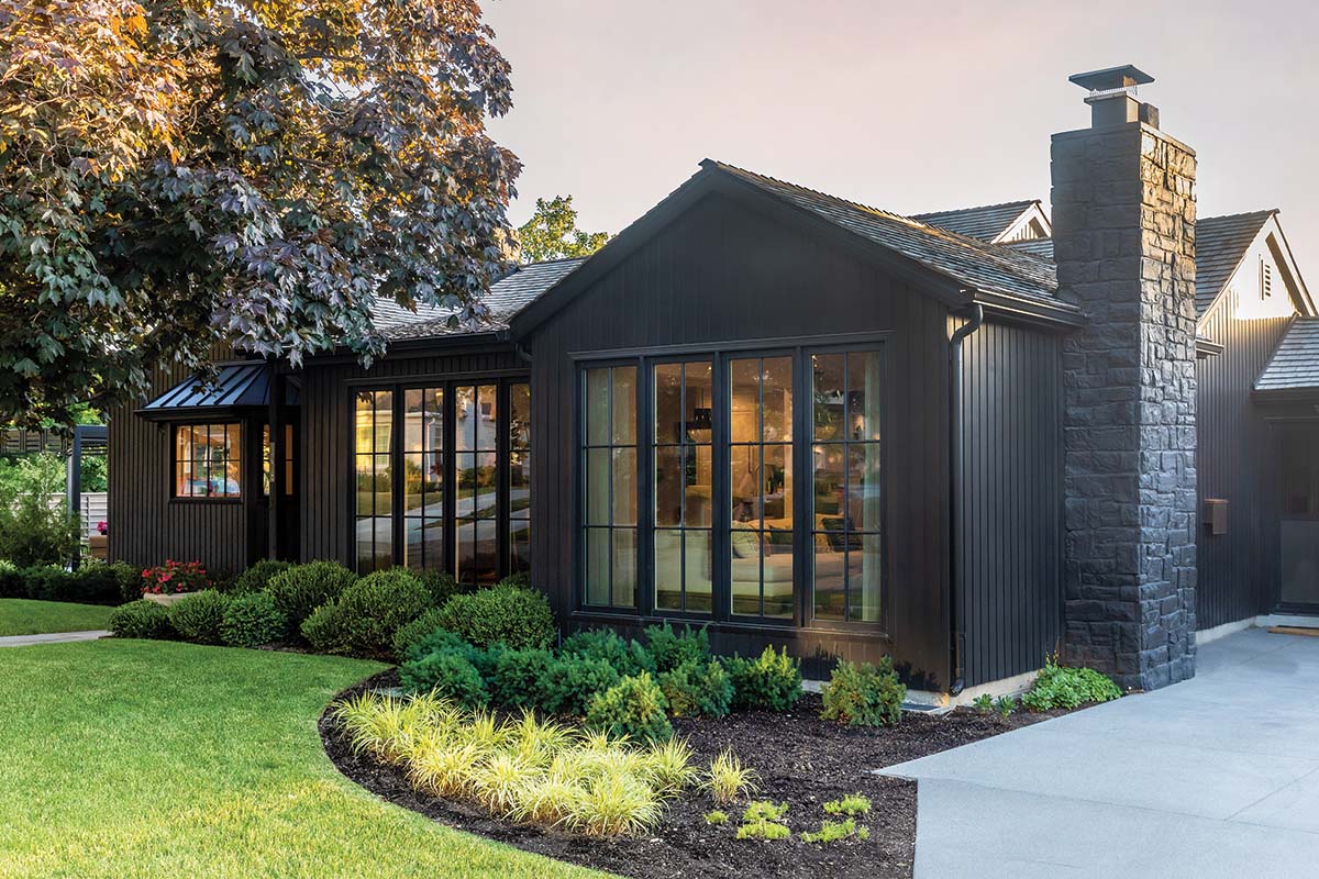
The transformation continued outside, where daring black paint, new windows and vertically oriented Boral TruExterior give the exterior a decidedly modern vibe. A new landscape created by designer Rob McFarland adds deep gardens and layers of lush greenery to the wide, narrow property. McFarland also introduced new fencing, screening hedges and a pair of custom pergolas that shade a freshly conceived outdoor living area located off the end of the cottage.
The house sits on a wide and shallow corner lot. Landscape designer Rob McFarland ditched the sideyard’s attached pergola and small stamped-concrete patio as he transformed the challenging area into a private outdoor living oasis replete with low-maintenance gardens, a fire pit, fountain, hot tub and large patio shaded by double pergolas. Landscape installation by Schocker Landscape

“The house felt like it abruptly ended with a shallow side yard, but the pergolas graciously extend the line of the house and create such a great space for Courtney,” he explains. Little agrees and is delighted with the entire project, inside and out. “I love this home and am so proud of what it has become.”


