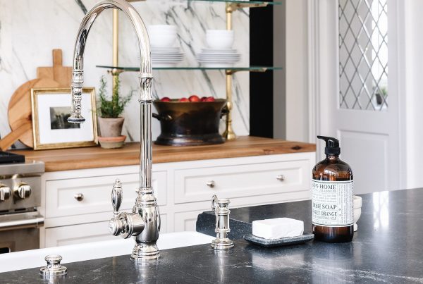
Designer Andrea West transforms a cramped and dated kitchen into a stylish, hardworking hub.
When Lindsey and Peter Wynia decided to overhaul the kitchen of their traditional ’90s home in Spokane, they had big changes in mind. Creating more usable and enjoyable space was top among them. “The kitchen was too small for the grandeur of our home, and a lot of its area was eaten up by a little-used pantry,” Lindsey recalls. The cramped room was also dark, outdated and functionally flawed.

Enter designer Andrea West, whose Instagram posts showcase many of her firm’s stunning projects, including a slew of inspiring kitchens. These images motivated Lindsey to reach out and hire the Utah-based pro, who worked remotely as she collaborated with the Wynias to transform the kitchen for their active family. “I was obsessed with her work’s transitional aesthetic,” recalls Lindsey.” I wanted to upgrade my traditional kitchen with a more modern vibe and to create a room that excites me to spend time there.” Here’s a look inside the reimagined room and a dozen savvy ways West delivered new life to the home’s old kitchen.
Open Up
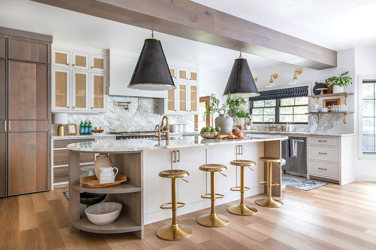
“We began by reworking the floorplan,” West explains. She removed an inefficient butler’s pantry, using its space to give the kitchen more livable area and to improve its traffic flow. West also removed a dropped tray ceiling that contributed to the kitchen’s cramped dimensions. A new floor-to-ceiling pantry provides plenty of space for storage.

Pass on Stark White
Ditching the kitchen’s dark finishes and heavy features, West replaced old cupboards with custom cabinetry pairing Egret (a white paint with taupe undertones) with a light gray stain. “I didn’t want a traditional white kitchen, and I love a dramatic, two-tone design,” Lindsey says. West also swapped out dark granite and tile with milky white marble. Chantilly Lace paint freshens the walls. “It’s a crisp, yet warm white,” West says.
Team Curves and Corners
Curved and rounded elements, from the island’s radius ends and vintage-style barstools to oversized pendant lights and arced shelf brackets, counter the room’s squared-off range hood, paneled cabinets and clean-lined edges. The curves not only add a sense of comfort and ease to the space, but also connect with the form of an arched niche original to the home.

Think Big
“I’m all about a large island,” Lindsey says. West responded with a 12-foot-long island featuring a deep, 12-inch overhang that accommodates comfortable seating and four stools at the counter. The island includes Lindsey’s must-have prep sink and provides loads of storage in its base.
Finish the Floors
While sanding the original wood floors, the team discovered they were too soft and unable to be properly stained. West replaced them with Luxury Plank Vinyl (LVP). It resembles real wood and provides the durability, waterproofed quality and easy care the busy family (and its two dogs) need. “Plus, the floor works seamlessly with the new design of the home,” the designer says.
Layer Lighting
“Accent lighting sets the tone of a space and makes it more cozy,” says West, who chooses sconces, pendants and even lamps to supplement overhead lighting in kitchens. “This layered lighting makes a room feel so different when the overheads are off.” A mix of finishes and forms adds to accent lighting’s decorative power, and their shades and diffusers eliminate unwanted glare emanating from exposed bulbs.
Deliver Drama
Shots of black counter the room’s lighter tones. Dark accents include an Ilve range, gridded window frames, accent pieces, Roman shades and large Visual Comfort pendants. “I love the oversized pendants—they are so dramatic,” Lindsey says. West agrees. “They also deliver the scale the island deserves.”
Embrace Marble
The homeowners craved real marble, so West selected Calacatta Vagli to complement the cabinet finishes. “It has a lot of warmth and character, but it doesn’t look like it is trying too hard,” West says. The elegant, milky white marble flows from the countertops to the backsplashes to achieve a seamless and timeless look.
Include Open Shelves
West exposed shelving on the ends of the island to offset its large scale while creating a place to store and display everyday items like bowls, platters and stacked dishes that are too big for upper shelves. Smaller shelves frame the window above the sink and artfully showcase easy-to-reach glassware and a mix of eye-catching accessories.

Go for the Gold
“Every space needs a little gold,” says West, who favors antiqued brass for the warmth and timeless look it gives a room. This kitchen’s hardware, lighting, plumbing and even the Ilve range trim deliver a mix of gold finishes. “Don’t duplicate them. You want a variety of unmatched tones,” the designer advises.
Cane your Cabinets
“Mixed materials make a room look more collected and lived in,” says West, who chose timeless cane panels to front upper cabinet doors. “A natural material, cane relaxes the space better than more formal glass and hides what is behind the door more effectively.”
Add a Drink Station
Located opposite the working side of the kitchen, a much-used drink station provides function while balancing out the design and drama of the main area. A diamond-pattern marble backsplash, open shelves, cane-front uppers and dark base cabinets with light-toned doors complement the design of the main kitchen without duplicating it. “We wanted it to have its own style,” West says.
See more from Andrea West here.

