Written by: Brad Mee | Photos by: Scot Zimmerman
Simplification. That’s what architect and master builder Gary Francis identifies as the driving force behind the recent transformation of a Deer Valley home he designed and constructed over 30 years ago. One of the resort community’s first dwellings, the ‘80’s home had all the markings of the era: traditional mountain design, heavy wood elements, dark and fragmented interiors, modest windows and big gables. When its owners decided they wanted an updated mountain vacation home, they faced a big decision: Should they remodel their outmoded residence or tear it down and start from scratch? They turned to Francis and interior designer Paula Berg for help.
“The existing house had great bones,” Francis explains. Nearly every significant space was located on the site exactly where he would have placed them anew today, and their sequence, dimensions and volumes were nearly ideal. Instead of scrapping the decades-old dwelling, the team stripped it down to the studs—inside and out—and converted it into the owners’ vision of a perfect mountain sanctuary. “Today, it is the polar opposite of what it was,” Berg says.

A light-filled corner offers a place to savor the mountain landscape. A walnut daybed by Ralph Pucci sits on a hair-on-hide Mansour rug. Side table by Gregorius Pineo.

Architect Gary Francis opened the back of the Deer Valley home with a expansive windows that fill the interior with light and views.

Vintage bicycle parts and recycled glass combine to create a one-of-a-kind light fixture hung in the upstairs landing.

Hushed tones enrich a sitting room located off the entry. Ironies wing chairs gather around a faux bois table. Rift oak paneling clads the walls and a Tufenkian rug from Regency Royale warms the floor.

For the dining area, Berg designed a large hutch crafted from wire-brushed rift oak by Bradshaw Design. Lace-back caster chairs by A. Rudin surround a round table illuminated by an Atlas lantern by Formations.

The kitchen opens to the home’s main living areas and back patio. Honed marble from European Marble & Granite tops cabinetry and islands crafted from rift oak by Teerlink Cabinets. Lantern pendants by Gregorius Pineo; branch chandelier by Paul Ferrante.
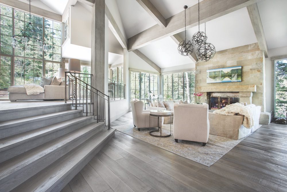
Bold changes unfurl from the moment one steps into the spacious entry, richly paneled in calming, sand-toned rift oak. Once anchored by a heavy, U-shaped staircase, the foyer now greets visitors with broad, open steps ascending directly to the third and fourth levels. Expansive new windows and doors draw one into the home’s main living areas with light and views of the wooded property. “Now the stairs invite you straight up and into the house without obstructions,” Francis says. There, he masterfully revised ceilings, inserted spectacular new fenestrations, reduced compartmentalized spaces and fashioned an unimpeded flow that makes being in and moving through the open and active living, dining and kitchen spaces effortless and enjoyable. “Gary approaches his projects as an artist,” says Berg. She, in turn, creates artistic statements and solutions of her own.
Berg’s first undertaking was devising a palette and style to serve as the foundation for the personalized interior the homeowners desired. “They wanted a calming home, one defined by a light, peaceful color scheme, subtle sophistication and a Zen-like ambiance,” Berg explains. The designer began with driftwood-toned, white oak floors that introduced shades of gray, while allowing warm tones to emanate. “The wife likes gray but didn’t want a gray house,” Berg explains. To that end, Berg conceived a quiet color mix of beiges, taupes and grays providing a neutral backdrop for the owners’ curated art collection and views of the wooded site.

In the master bathroom, a wall of polished Colorado Yule Marble from European Marble and Granite provides a stunning backdrop for a Voltaire freestanding bathtub by Waterworks.

A Waterworks washstand sparkles against an elegant backdrop of driftwood-toned woods and wallpaper in the master bathroom.

A study in sophisticated tone-on-tone decorating, the soothing master suite is anchored by a Gregorius Pineo paneled canopy bed dressed in Matouk bedding. The handwoven Lapchi rug is from Regency Royale.
To prevent this subdued palette from being overly sedate—a common pitfall with many muted, monochromatic interiors—Berg inserted a mix of wood, metal and natural stone, integrated with unique details to add depth and dimension. Textured fabrics and furnishings join nature-inspired treatments room to room, including marble-pattern-upholstered wing chairs encircling a silver faux bois table in the elegant sitting room, a Ralph Pucci walnut daybed set upon a hex-patterned, hair-on-hide rug in the living room, petrified-wood side tables in the casual family room and a rush-paneled, hammered iron canopy bed by Gregorius Pineo in the luxurious top-floor master suite. Illuminating them all, carefully chosen lighting fixtures add equally to the décor’s intrigue. “In a subtle décor, you have to create moments,” Berg says. A prominent, tiered chandelier crafted from recycled glass and vintage bicycle parts hangs in the entry, a fixture of gnarled iron branches lights the kitchen table and a cluster of hand-forged iron orbs dangles from the living area’s soaring ceiling. “The client wanted a little bling, and lighting performs like jewelry throughout the home,” the designer explains. While the fixtures are certainly memorable, none can compete with the resplendence of a Waterworks freestanding bathtub staged like sculpture before a wall of polished, richly veined marble in the master suite. “It’s simply stunning,” Berg says.
In the end, the strength of the design lies not only in its one-of-a-kind details, but also in its simplicity and quiet beauty. And that’s exactly as the owners would have it. They much prefer spending time in a vacation home that is as serene and sublime as its secluded mountain setting.

Located on the second of the home’s five levels, the spacious main entry establishes the interior’s understated sophistication and calm from the moment one steps inside. Rift oak paneling adorns the walls, and a large rug by Mansour dresses the oak floor. Boreal bench by Ironies.
Sanctuary of Style

1. Petrified-wood side tables pair with an A. Rudin sectional in the family room.

2. A mix of metals, woods and texture-rich rugs deliver depth and dimension.

3. A freestanding tub performs like sculpture in the master bathroom.

4. Textured basalt stone pairs with smooth marble on the master suite’s fireplace.

5. Rustic to glamorous, unique light fixtures finish off the design in every room.

6. New windows frame a large stone fireplace in the luxurious living room.
 7. Marble-patterned fabric and shimmering nailhead trim dress an Ironies wing chair.

8. The built-in bar boasts rift oak, antique mirror, quartz top and metal details.
Featured image: The home’s main living areas follow the slope of the land and are connected by sets of wide steps starting at the home’s entry. Wide-plank white oak floors play a pivotal role, visually connecting the open spaces where function and furniture groupings delineate the floor plan. Hand-forged iron lanterns by Gregorius Pineo hang above Mimi London sofas upholstered in a fabric from Holly Hunt’s Great Outdoors collection. Jean De Merry wing chairs and a custom Mansour rug help ground the space in tranquil, natural tones.
Get more decor inspiration, see our Fall 2017 Issue.
Sources:
Architect and Builder: Gary Francis; Cody Bonham, Construction Superintendent, G Francis & Associates, Park City
Interior Design and furnishings: Paula Berg, Paula Berg Design Associates, Park City


