A new Mapleton home melds old-world styling with contemporary flair.
Stacy Andersen and Joey Johnson had the itch. As the owners and principal designers of Remedy Design Firm, the duo had fashioned new homes for many others, but now they wanted to create one without a client in tow. “We wanted to push our own style and design without the caution and considerations that are part of working for a homeowner,” Andersen says. The duo teamed with Curtis Design Group’s Mitch Lee and R.C. Dent Construction’s Scott Dent, and together they conceived and crafted a custom home on a ribbon of property in Mapleton.

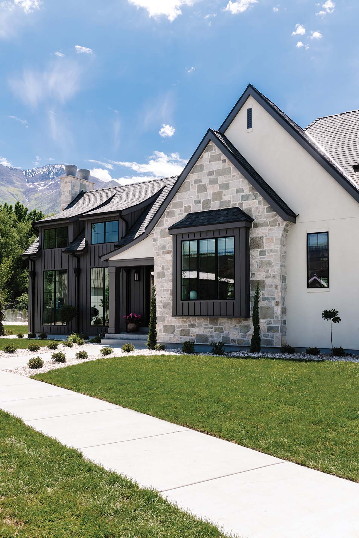
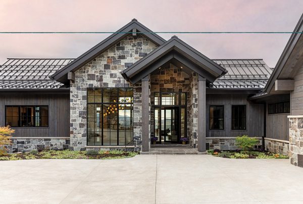
“We wanted to come up with something unexpected,” Andersen says. Architectural designer Lee devised a moderately sized, contemporary-meets-old-world style home befitting both the neighborhood and the challengingly long, narrow site. “It’s basically a rambler that’s very linear with a maximum of two rooms deep, front to back,” Lee says. From the outside, the lofty great room, clad in dark siding and loaded with windows, teams with a tall, glass-fronted staircase to make the house appear much larger—more like a 1 1/2 story home, Lee explains. A high-contrast palette, wide-plank siding and mixed stone deliver contemporary flair while swooping roof lines, bay windows, shallow soffits and an arching buttress nod to the past. “It’s more of a modern Tudor without any of the gingerbread,” says Johnson, noting the lack of brick or decorative half-timbering characteristic of many Tudor Revival homes.


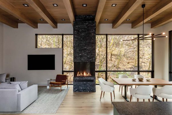
Inside, the home is light-filled and open, making the main level’s 2,400 square feet feel spacious and inviting. The front door opens into the great room, located at the east end of the home. There, generous light, mountain views and strong architectural elements prevail. The gallery-like space hosts the main gathering and entry areas, and it features a 15-foot vaulted ceiling, soaring windows and limestone-clad fireplace wall. “This is one of the key moments in the home,” says Lee, who adjoined the great room with the home’s open dining and kitchen spaces.


A main corridor leads from the kitchen to an office, staircase and a secluded primary suite beyond. “We organized the rooms to maximize the views, the flow and the light,” Lee says. Nothing feels tight or pinched. “We were excited that this isn’t an overly large home, and because the house is narrow, we used an open concept to make it work,” Johnson adds.
For the interiors, the designers craved a calm but compelling décor with a European sensibility, a neutral palette, and lots of natural elements and engaging textures. “The world is such a chaotic place, so we wanted to create the clarity and serenity that an uncluttered home provides,” Johnson says. Peaceful interiors, though, don’t prevent spirited statements. In the light-filled great room, for example, mortar is spread like butter on bread across a towering wall of blended limestone before being partially wiped away. “It resembles an old European cottage,” Andersen says.

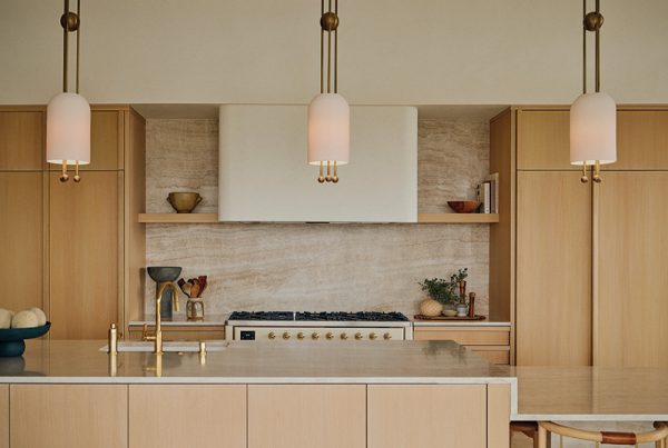
In the primary bedroom, herringbone-patterned planking animates a deep ceiling tray. The designers also coupled the office’s wood floor with a walnut ceiling above. “They’re the caps and boots of the room,” Johnson explains. Intriguing lighting fixtures also pepper the décor. Airy iron chandeliers hang above the dining table while nearby, milk glass pendants and brass-shaded wall sconces illuminate the kitchen with their divergent forms. “Lighting is particularly difficult to get right in open spaces,” Andersen says. “It’s really a balancing act.”


Andersen and Johnson have a penchant for elevating calm color palettes with generous texture. Nubby rugs anchor furniture groupings atop narrow-planked wood floors, loosely grouted brick backs the kitchen’s range wall, and lux linens and leather pillows dress the numerous beds. Shots of tonal contrast are also pivotal to the design of the main level and the walk-out lower level. Creamy white cabinets set off the kitchen’s walnut island, dark sofas add visual weight to the light-washed living room and black glass-front towers rise from pale stone countertops in the primary bathroom. Throughout the home, rounded forms mix with strong lines and sharp angles, adding more contrast. “The curves also soften the design,” Johnson explains.


While the home’s narrow lot provided challenges, it also inspired the home’s moderate size and scope—a boon for the designers. “A lot of large homes seem to lose their way,” Andersen contends. “The design of some of their rooms is really strong, but it peters out in others.” But not here. Johnson explains, “We were committed to creating beautiful spaces and special design moments throughout the house.”

