A palette of natural materials and neutral tones delivers comfort and warmth to a Lehi home’s inviting contemporary décor.
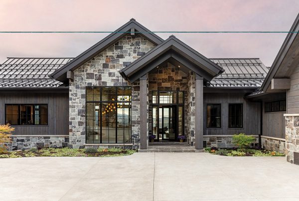
Call it a point of view. When a couple decided to build their family home in Lehi, they envisioned a house that makes the most of its scenic property by capturing the surrounding mountain and valley vistas. “They wanted to celebrate the setting, indoors and out, ” says interior designer Allison Campbell, who teamed with architectural designer Bryson Carrick to satisfy their clients’ wants—and then some.
The owners craved a clean-lined, contemporary style for their new home, but a minimalist glass box was not an option. “They are such warm, inviting people that we knew a cold, sterile house would be wrong,” Campbell explains. Instead, the architecture’s simple lines and walls of windows enclose an open, flowing floor plan designed to accommodate one-level living in absolute comfort. “It’s really a rambler with main living on the upper floor and secondary spaces downstairs,” she adds.
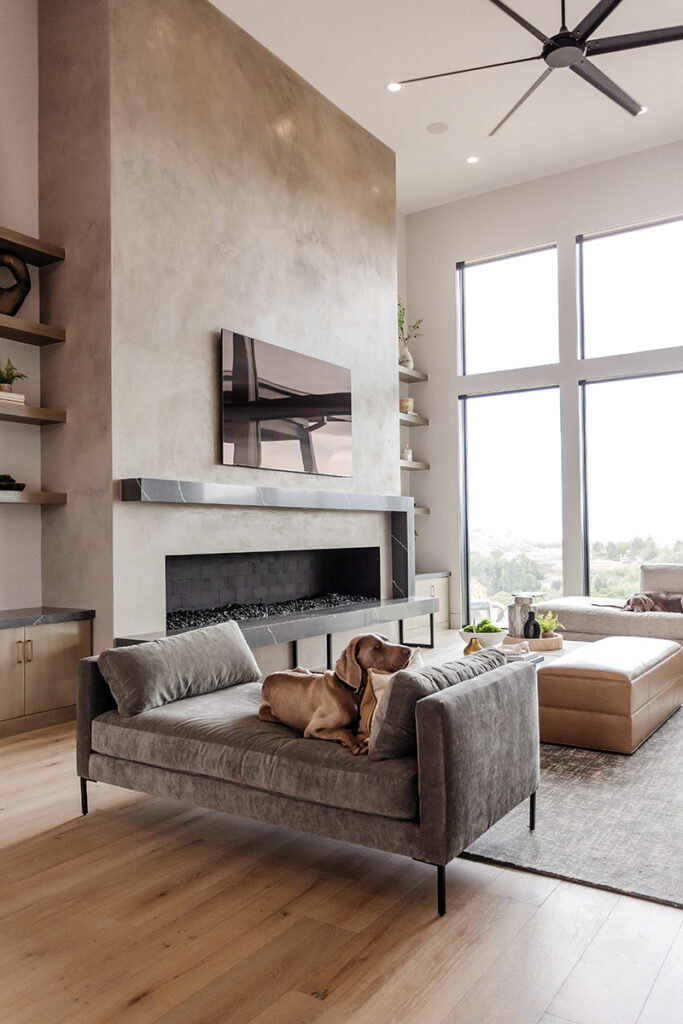

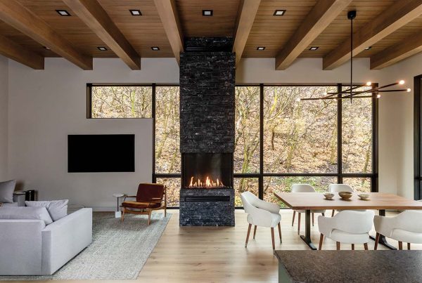
When guests enter the large, pivot-hinged front door, they’re greeted by a spacious entry and a great room opened with expansive walls of floor-to-ceiling windows. A mix of soothing tones and natural materials complement, rather than compete with, breathtaking views of the natural landscape and valley beyond. But the abundant windows present a challenge. “You have to fight to keep a home with open spaces and lots of glass from feeling cold,” Campbell explains. With that in mind, she selected Sherwin-Williams Solstice for the walls. “It looks white, but it has more color and is warmer.” The designer also chose medium-toned, white oak floors to help prevent an ambient chill. Elements of stone, dark-hued plaster and layers of texture do the same, explains Campbell, who also composed a color palette teaming with tones of cream, putty, camel, buff and warm gray. “It’s neutral but definitely not boring,” she says.
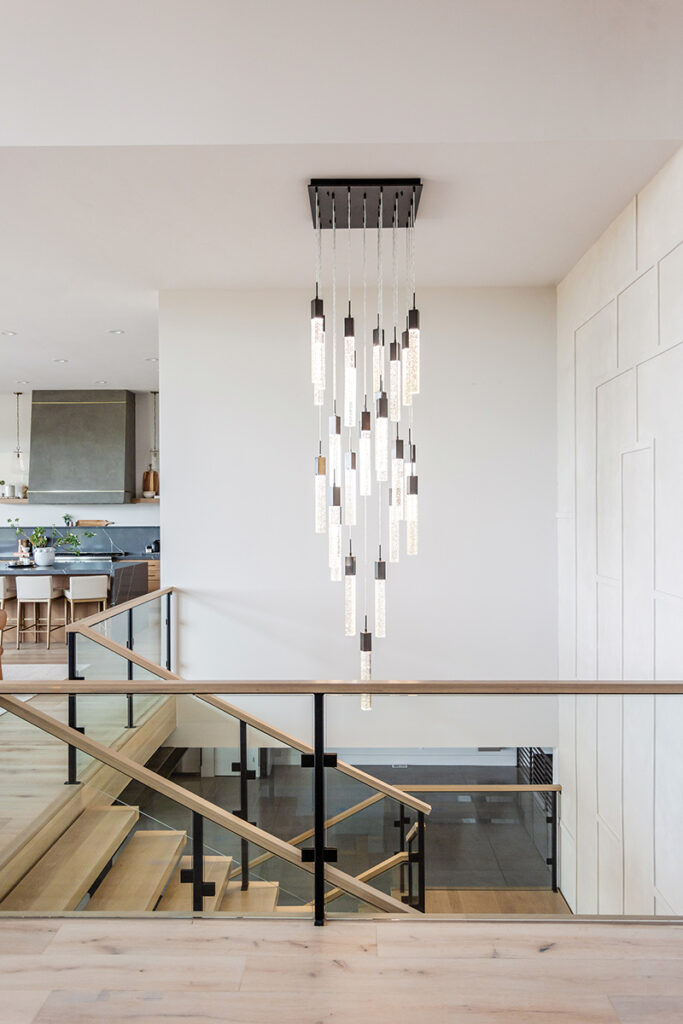


Not one to shy away from statement-making drama, Campbell clad the great room’s enormous fireplace with darker plaster and paired its oversized firebox with an asymmetrical hearth and mantel crafted from quartzite. “The large scale suits the space and the off-balance design adds contemporary flair,” the designer explains. Across the room, a floating steel staircase featuring thick, white oak treads performs like a functional sculpture enclosed by glass railings and a two-story wall of limestone-finished box panels. A dazzling multi-pendant chandelier hangs from above. “The composition is truly a work of art,” Campbell says.
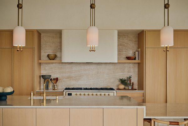
Statement-making features continue in the kitchen, where an expansive above-the-sink window invites views and natural light to flood the space. Dark quartzite countertops add visual weight as does the range hood, plastered mid-gray to match the fireplace across the room. “The hood and fireplace wall are like bookends that balance the open great room,” Campbell says. Making a strategic move, the designer hung the kitchen’s traditional pendant lights near the back wall rather than above the island to prevent them from visually fighting with the “uber contemporary” fixture above the nearby dining table. Predictable matching has no place here. “Mixing and layering different styles and materials adds longevity to a home’s design,” Campbell explains.
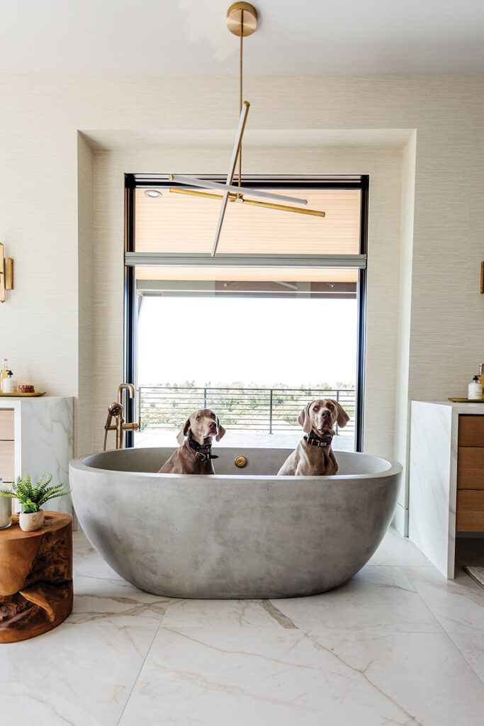


The most luxurious layering resides in the primary suite. With its large windows draped in velvet, its dropped ceiling dressed with grasscloth and its fireplace clad with plaster, the bedroom is a sanctuary filled with soothing tones, rich textures and sumptuous fabrics that include relaxed linens, plush velvets and posh wovens. “The bedroom should be, and is, an escape from reality,” Campbell contends. The same holds true of the bathroom, where broad windows and grasscloth-covered walls serve as an engaging backdrop for a shapely concrete tub, waterfall-style vanities and mirror-mounted faucets.
Throughout the house, the designer masterfully repeated elements from her edited palettes of materials and colors, using them in varied ways and volumes, space to space. “Consistency is key to creating a sense of continuity and comfort,” she explains. And given the carefully curated spaces that flow throughout this home, another source of compelling contemporary style and laid-back luxury waits just around the corner.


