Photography by Rebekah Westover
“It was all about the mix,” says Katie Phelon, lead designer with Remedy Design Firm. She and principals Stacy Andersen and Joey Johnson teamed with home designer Joe Carrick and builder McEwan Custom Homes to create a new family residence in Utah County. The homeowners’ personal style drove the design from the very beginning. “It is a very unique home with some elements that are more traditional, others are rustic and still others are more transitional,” says Devin Dye, McEwan’s project manager. “It’s a mix of ideas done very well.”


The owners came to the table with a wish list that began with a spacious, livable floor plan. The team delivered with common areas and a primary suite on the home’s main level, while the upstairs comprises children’s bedrooms and an office. The lower level caters to guests and fun-seekers, featuring everything from a bunk room and an indoor pool to a climbing wall and sports court.


Guests enter through large double doors that open to the welcoming entry. An expansive wall of windows immediately draw them into the nearby great room and its light-filled living area. With a soaring ceiling and broad mountain views, the space showcases two of the husband’s must-haves: beautiful reclaimed hickory floors and rustic, reclaimed oak beams that recur throughout the home. These timeless elements ground the white-walled interior with rich wood tones, compelling texture and eye-catching craftsmanship. “The beams were the owner’s baby; he even hand-selected them from a source in Idaho,” Dye explains.


The woman of the house craved more transitional and vintage elements. “She wanted a casual, comfortable home with a charming, lived-in look and feel,” Phelon explains. Once the beams and floors were selected, the wife said “I got this,” and the décor developed. Memorable elements abound. The doors to her off-the-entry office, for example, were reproduced from distressed antique versions she admired. “We replicated them with new doors that function like new but still look distressed and old,” Dye says. The same sleight-of-hand gives the laundry room’s new Dutch door an age-old appeal.


To ensure the owners’ personal style prevailed, the Remedy Design team created a neutral backdrop upon which special features and details stand out. “We chose the kitchen’s cabinet color as the jumping off point,” says Phelon, who lightened Farrow & Ball’s Shadow White for the custom cabinets. They teamed it with Benjamin Moore’s Simply White, which dresses most of the interior’s walls and trims. “These warm whites work well together, and their subtle color differences add interest,” she explains. Shiplapped surfaces feature a slightly darker white that adds yet another layer to the interior’s unifying, white-toned canvas. “You have to be careful when creating this type of palette,” Phelon warns. “The worst is to pick a bunch of whites that don’t work well together.”


The interior’s light-filled spaces easily embrace the curated mix of rustic, vintage and transitional elements with a relaxed, layered sensibility. Take the great room, where the expansive space is grounded by a towering stone fireplace and was made comfortable and cohesive with a mix of handsome furnishings dressed in lux-yet-livable performance fabrics. The gray velvet sectional and muted herringbone-covered spindle chairs, for example, team with a tufted leather ottoman and a subtly-patterned rug. “We’re not much for crazy patterns or colors,” says Phelon, describing an edited palette of understated materials and colors that unifies the décor throughout.


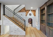
The designers ensured that boredom has no place in the décor with surprising contrasts running throughout. The entry, for instance, gets a shot of daring with dark balusters and a wreath posed against a black wall. The kitchen and dining areas are similarly animated. They boast a perfected pairing of white-painted and natural walnut cabinets teamed with shimmering Cloe tile and notable light fixtures, some black iron and others brass. “There’s not just one moment; we repeat elements to create cohesiveness,” Phelon explains. Perhaps the most striking example is the primary bathroom, where a Tudor-style metal barn door and a black freestanding tub add bold contrast to the room’s light and airy décor.
The house may be new, but as Phelon says, it feels a bit lived in and that’s by design. “It has a comfortable, functional and collected feel that reflects the owners and their style,” she says. Dye agrees, “The team took the vision the homeowners had and made it work.” Through thoughtful planning, savvy choices and successful collaboration, it is an outcome they had all imagined from the start.

KEY TO THE STYLE
The color scheme is neutral with contrasting accents created primarily of natural elements including wood, metal and stone. The Remedy team used an edited color palette to drive the home’s décor. “All the colors we chose are natural tones that make the home feel more comfortable and cozy,” says Phelon.

Tour every home featured in our 2021 Fall issue here.


