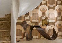
Kara DiOrio tackles the remodel of an outdated Avenues home, transforming it into a celebration of light-filled spaces and clean-lined design.


“Why would I want to look at a tree in the middle of my house?” asks interior designer Kara DiOrio, referencing an antiquated atrium inside the 1975 home that she and her husband David Goldsmith found while house hunting in Salt Lake City. The interior courtyard was just one of the outdated property’s many challenges, but the home’s views were breathtaking. located at the top of the Salt Lake’s charming Avenues neighborhood, the hillside house overlooks City Creek Canyon and offers broad vistas of the mountains and the Great Salt Lake. For this couple that clinched the deal.
“From the very start, views were the driving fire behind our search,” DiOrio says. The designer also preferred a rundown home to one that had been recently renewed. “If not new construction, then I wanted a house that I could gut,” she explains. “I didn’t want to pay for someone else’s remodel that I would tear out anyway.” Armed with plans to bring the property into the 21st century and make it their own, the couple bought the house and the transformation commenced.

“The original layout consisted of small rooms, narrow hallways, a tiny kitchen and a choppy flow,” DiOrio recalls. That was exactly the opposite of what she imagined for the couple’s new nest. “I wanted an unobstructed and modern floor plan–one that would feel spacious, well-planned and uncluttered.” To that end, the designer widened hallways, moved bathrooms, ditched superfluous headers and doors, enlarged some windows and added others.

To create more livable space, she removed unnecessary closets and storage features. She also scrapped that outdated atrium and used its space to help turn a tight galley kitchen into an open room characterized by clean lines, bright light and a high-contrast color palette.

Once the bones of the home were complete, DiOrio turned her attention to the home’s décor.
What had been a cluster of rooms throughout the 3,500-square-foot home is now a sequence of inviting, spacious rooms and uninterrupted vistas punctuated by eye-catching art, finishes and furnishings.
The main level’s open living room area, for example, flows seamlessly into the dining room. Mirrored walls anchor each space. “When we purchased the house, the living room’s fireplace wall, as well as the opposite wall in the dining room, were clad wall-to-ceiling in bronze mirror,” DiOrio says. “That has to go,” she recalls saying. But after months of living with the mirrored walls, she embraced their power to visually expand the space and multiply scenic views. She updated the mirroring–swapping out the bronze finish for black–and pared back the expanse of glass surrounding the fireplace. An intimate sitting area now fronts the fireplace and features and eclectic mix of old and new furnishings, as well as a texture-rich mix of materials including wool, wood, linen, velvet and rattan. “They balance the elements of mirror, glass and chrome,” DiOrio explains.

An adjoining sitting area cantilevers out from the upper level, leaving loungers with the feeling of floating over the landscape and verdant canyon. “I don’t know when this space was added to the original 1975 home, but the move was brilliant,” DiOrio says. So too was her decision to keep the area’s original fenestration and to paint its window frames white to match the walls, preventing them from intruding on the views. She chose twin loveseats that are low to the floor to keep sight lines clear, and included small round tables and organically shaped cowhide rugs to soften the rectangular windows’ strong lines and symmetrical pattern. “The space is like a little jewel box,” DiOrio says.


Among the designer’s fortes is an eye for intriguing lighting and compelling art. This project showcases both. “I love art and always identify good art walls in a project,” says DiOrio, who is equally passionate about light. “Good lighting delivers everything to an interior.” Because the designer prefers clean ceiling planes, she minimized can lights throughout and orchestrated a compelling mix of high-style fixtures. In the small entry, for instance, she hung a single Flow pendant that teams with loads of natural light to illuminate the space and a nearby stairwell, spectacularly updated with a glass railing. She intentionally left the two-story stairwell devoid of art. “Negative space gives the eye a place to rest,” she says.
Not to worry, there are plenty art pieces to occupy it throughout the interior, including inside the lively powder room. There, DiOrio artistically combined a framed collage by Gary Vlasic with a blue-painted ceiling, bold wall paper and a Geneva Sconce from Fuse Lighting. “When I realized the paper’s looping pattern perfectly mimicked the sconce’s cord, it was a fait accompli,” she says.

Thanks to DiOrio’s deft editing throughout the home–from the serene master suite to the inviting living spaces, and the vibrant kitchen to the open patios–even the simplest details have the power to delight and the home’s prized views reign supreme. “They are ever-changing art that fill us with awe and gratitude every day,” the designer says. And that derelict atrium that anchored the original décor? Well, it’s a distant memory. Today, the couple’s focus is on enjoying the hillside home and the new design DiOrio created to bring it back to life. “Every day I pinch myself and think of how much I love it.”

Why This Design Works
Savvy Design and keen details create expansive light and inviting, open spaces.
- White walls, ceilings and trim flow throughout linking the spaces and creating comforting, space-expanding continuity. The single-color approach also allows the eye to move through the décor uninterrupted.
- To open the interior and foster the free flow of light, the designer widened hallways and removed walls. She also eliminated every unnecessary header, a trick that visually raises the ceiling height, opens hallways and heightens openings.
- “I left openings without doors unless privacy was needed,” DiOrio says. The designer also chose doors of sand-blasted glass for the pantry and master toilet room, creating a sense of openness and light.

- Mirrored walls and reflective finishes visually enlarge spaces, while maximizing the interior’s light and views.
- To elevate the ceiling’s modest 8-foot height, DiOrio rejected the use of crown molding and avoided unnecessary can lights that clutter the overhead surface.
- Continuous flooring creates a seamless flow from space to space.
- To fill the home with natural light, DiOrio created a skylight from the original atrium opening, added and expanded windows and used window coverings only where they were needed for privacy.
- Low-profile furnishings stay low to the floor, allowing sight lines of views and adjacent rooms to flow with minimum visual obstacles.
See more home inspiration here!
SOURCES:
Design by Kara DiOrio, DiOrio Design
Landscape by Rob McFarland, SLC
Mirrored surfaces and glass: Solar Window & Door
Granite: Phillips Marble Shop, SLC
Wood Flooring: Underfoot Floors, SLC
Art: A Gallery with Allen & Alan Fine Art, SLC


