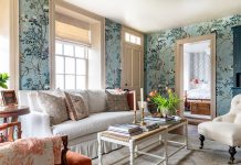
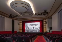
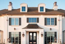
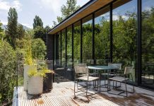
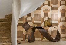
Originally a wedding photographer, Rebekah Westover has been shooting beautiful interiors around Utah for nearly a decade. Her latest cover shot graces our current issue of Utah Style & Design magazine (USD). She has been featured in our pages multiple times, as well as in Traditional Home, Country Living and The Wall Street Journal, and today she’s be giving us a peek into her work as a hot-shot interior photographer.

USD: You started as a wedding photographer; How did you transition to interiors?
I did weddings for about 15 years. That’s how I met everyone on the Utah Style & Design team, was providing content for Utah Bride & Groom magazine. Brad (USD Editor) would occasionally pull my tablescapes and decor from styled shoots to feature in USD, and that is how I got on the radar with the interiors.
About 8 years ago, I completely redecorated my own home with help from Gatehouse No. 1, who I became very close with. I took a few shots of my house when it was finished and sent the images their way, asking if they would ever want me to shoot any projects for them. They were all about it, because they’d never had any of their projects photographed at that point. Even 8 years ago, interior photography wasn’t really a thing. They started hiring me to shoot all of their projects. The beginning of this year, I retired from weddings and decided to focus entirely on interiors. They are so much more my jam!

USD: Do you have a favorite project or a most memorable shoot?
It’s hard to pick a favorite, because I can appreciate good design in all styles. I can walk into a modern home, or a farmhouse or boho design and think ‘this is fantastic.’ But my style, and the shoots that really resonate with me, usually lean toward a little traditional and a little bit of glam. The homes that have spoken to me the most design-wise are first, Rachel Parcell’s. Her style really aligns with mine: it’s traditional, feminine, but with a bit of spice. Then there’s another private client whose home is so beautiful: She stuck with a traditional foundation, but has things like gold barstools and like, Gucci wallpaper. Those are homes I walk into, and I’m immediately obsessed!

USD: What is it like to see your work on a magazine cover?
My very first cover was a Gatehouse kitchen on a USD issue! I was beyond flattered. It just validates all your hard work to know that someone else appreciates it and thinks it is display-worthy!

USD: Do you have any pointers for designers on how to prep their rooms for a shoot?
I would say I think it’s important for designers to be on site. If you really want to style a space, it’s great to be there, so book out a half day or full day to collaborate with the photographer and get everything looking exactly as you want it.
I don’t touch anything in a home while I’m shooting it. If I go into a home, I assume it is how the designer wanted it – I wouldn’t want them to edit my photos after I’m done, I give them the same respect that I would want as a creative.
On another note: Some designers think that showing the whole room is what you want to do. I always tell them that you don’t need to shoot the whole thing, you can shoot details and vignettes, and it tells a much better story. It’s much more compelling because you can focus on what’s happening in that moment rather than being overwhelmed by the whole space.

USD: What spaces are your favorite to shoot?
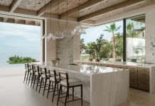
Kitchens! Kitchens are like the heart of a home– I always spend the most time in a kitchen. They’re usually the most expensive, too, and I really try to highlight that. From a design perspective, there are often so many beautiful things to highlight in a kitchen. I also tend to gravitate towards colorful kitchens. It’s a trend that is up and coming, and I am loving the coziness color can bring to a space.
USD: What equipment do you use?
I shoot on all Nikon gear. I have a Nikon v850, I like it because it’s crisp, the colors are beautiful and it has a big screen. But realistically, it’s not the camera that matters. It’s your creativity and artistry—and honestly the lenses.
I like a mid-range lens. My favorite is my 24-70, because it’s not too wide. I back up as far as I can, then shoot with that mid-range so the lines are clean and you avoid that distortion you see from wide-angle real estate shots, where the rooms all look ridiculously large. I reserve those lenses for super small spaces like bathrooms or closets to open them up. The mid range lens provides a more editorial look, and allows you to focus on the design work in the space.

USD: Final question: what is your favorite part of shooting interiors?
Collaboration. There is something magical that happens when a photographer, design team and even the homeowner come together and bring their best ideas to the table for a shoot.


