In Pleasant Grove, a team of pros cooks up a family-friendly kitchen loaded with smart design and Belgian-inspired decorative details.


Design inspiration comes from countless places, and for the owners of this Pleasant Grove home, the influential source was time spent in Belgium and the Netherlands. “We borrowed from the region’s simple and classic styles,” says interior designer Caitlin Creer, who joined the homeowners, Casey Cloward from Raykon Construction and Landforms Design to create the family’s dream house. And at its core, a welcoming kitchen serves as the most used and treasured space.
On the surface, the kitchen reads farmhouse, but with a more timeless rather than of-the-moment style. “We chose more classic details that don’t box it in to be cliché,” Creer explains. “They’re the hallmark of the design.” A dose of traditional, a measure of modern and heavy pours of charming detail mix to make this busy space as pretty as it is practical.
Floor Plan

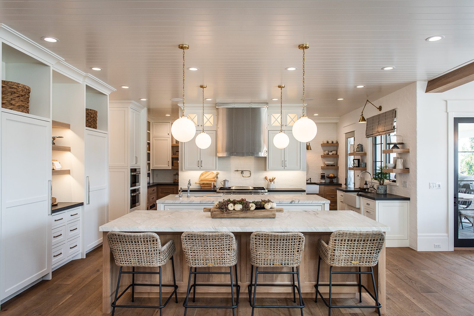
A functional floor plan divides the large kitchen into a work zone, casual at-the-counter dining spot and a spacious pantry—all designed to cater to the family’s love for entertaining. The central work area is anchored by a large prep island positioned in front of the range. A wall of integrated refrigeration and open shelving flanks the island at one end, and on the other, a window wall features a clean-up zone replete with a deep farmhouse sink and open shelves.
“Our client specifically requested that the main sink had a window above so that she could watch the action in the backyard,” Cloward says. The second island delineates the kitchen from the nearby family room and offers seating for casual dining and entertaining. Because guests inevitably end up in the kitchen, the design allows plenty of floor space for socializing, food prep and clean up. No traffic jams here.

A large pantry lives behind the main kitchen space and opens at both ends. As beautifully designed as the kitchen, it features a second refrigerator, third sink and loads of countertop and storage space. “It’s a hybrid between food storage and a finished butler’s pantry,” says Creer, who champions the separation of kitchen spaces. “Too much real estate makes a kitchen feel like a restaurant. If you break it up, it feels more intimate and homey.”
Materials
“We used a lot of white, black and wood as the jumping off point for the design that runs throughout the house,” says Creer. For the kitchen’s countertops, she paired thick Calacatta marble with Metropolis black quartz. “It’s a great cheat that resembles natural soapstone but is super durable and stain resistant,” she explains. She also teamed white-painted and natural white-oak cabinets with polished nickel hardware and antique brass light fixtures. “I like to mix and match materials so the space doesn’t look one note.”

Creer chose stainless steel for the clean-lined range hood and dressed it with simple panel and rivet details. “It’s a timeless material that’s not too fussy or formal,” she says. Shiplap clads the ceiling while oak floors and white walls provide a warm and neutral backdrop that fosters the simple, timeless look.
Details
The kitchen may be new, but it doesn’t look or feel like it. White-painted brick delivers texture and authenticity to numerous walls while hand-painted terra cotta tile backs open shelves, adding subtle pattern to the space. “We wanted nuances of Belgian style so the house isn’t too modern or farmhousey,” Creer explains. The shaker-style cabinets boast a clean-lined modern look, but handsome crown molding and four classic glass doors with X-mullions give them a more traditional bend.

For open shelves, Creer passed on showy accessories, choosing instead glazed pottery, cookbooks and everyday dishes for display. “They’re not dust collectors,” she says. “They’re functional items that add to the kitchen’s casual, livable style.” Woven barstools, wicker baskets and wood cutting boards do the same, while introducing comforting natural materials and textures. Cloward explains, “This kitchen has a lot of detail, but it reads simple and that’s its success.”

