Not much has changed in the ways we use our kitchens since the ‘80s. We still prep meals in them, store food in them, and gather and entertain in them. However, the feel and functionality we demand from them has changed over the years, as proven by the recent transformation of an outdated Orem kitchen by architectural designer Steve Tiek, interior designer Ali Henrie and contractor Carl Robison. They completely overhauled the River Bottoms neighborhood house, and the renewed kitchen is among its most special spaces.

The homeowners chose the property for its premium location. “The house sits on the Provo River, but you couldn’t access the river or its views from the back,” Tiek explains. The dwelling also lacked any meaningful style or architectural personality, so its owners turned to the team of pros to capitalize on the site and transform the tired house and kitchen. “We worked with the kitchen’s original shape, changed its floor plan, and gave the room a modernized French European style that our clients love,” Tiek says.
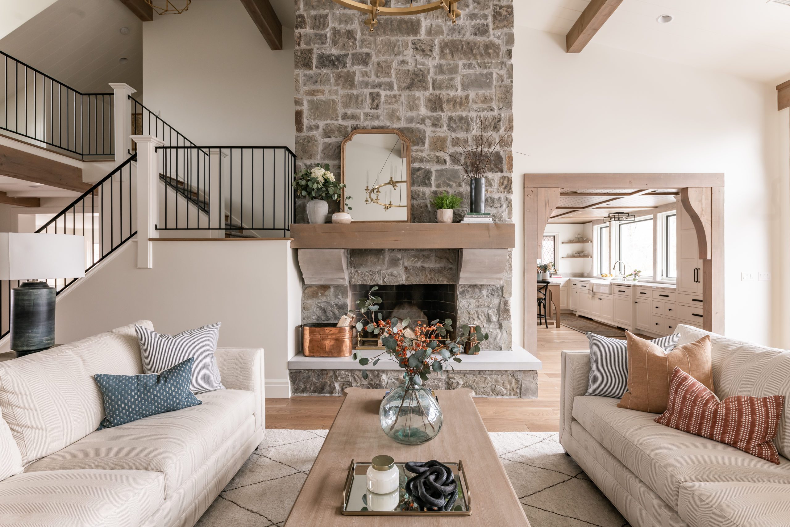
To begin, the designers addressed the kitchen’s layout. They removed a walk-in pantry that cramped the kitchen and narrowed its access to a separate dining room. “This immediately made the kitchen feel much larger,” Henrie says. So too did expanded openings to the adjoining dining and living room areas, handsomely framed in post-and-beam timbers. “They help delineate the space while keeping it open,” Tiek explains. “They invite you into the room.” They also foster its timeless, European style.

The team rid the room of dark, orange-tinted wood, and today, harmonious light tones prevail. “There is a lot of wood in this room, so we chose light stains to create a natural, timeless look that isn’t heavy,” Henrie says. The floors and ceilings are composed of natural white oak, as is the island base. “We stained them each in slightly different tones to soften and warm the space,” she adds. Tiek gave the 8-foot-high ceiling a visual lift with a coffered, tongue-and-groove treatment. “It actually makes the room feel taller,” he explains. The removal of dark upper cabinets that encircled the outdated room did the same.

Today, a painted floor-to-ceiling pantry cabinet, two banks of lower cabinets and a custom island provide all the storage space the empty-nest homeowners need. By eliminating upper cabinets, the design team was able to use the room’s walls for enlarged over-sink windows, a custom hood framed by leaded glass windows and open corner shelves created for setting and displaying everyday serving pieces and dinnerware. “This design opened the room, making it feel larger and filling it with river views,” Tiek explains.


Decorative choice also played an important role. Black bistro-style stools and glazed pottery pieces set a relaxed, convivial mood, while Taj Mahal quartzite lends elegance and pattern to the countertops and backsplashes. Dark window leading, black hood panels and an engaging mix of metals—including polished nickel faucets, black hardware and brass-based pendants—play off cream-toned cabinets and walls with sure-fire results. “This is not about trendy contrast,” Henrie explains. Instead, the designer wanted something “more subtle and timeless.”
The new kitchen is exactly what the owners craved, Henrie says. “It’s not a super formal style. It’s an elevated form of casual that’s comfortable and impressive.” Tiek agrees and credits the remodel’s success to a winning team. “The collaboration was fantastic,” he recalls. “Our clients were really involved yet were very trusting in what we could create for them.”
Architectural Design: Steve Tiek, Tiek Design Group, Lehi
Interior Design: Ali Henrie, Ali Henrie Design, Orem
Contractor: Carl Robison, Robison Custom Homes, Orem
Cabinets: Peterson Woodworks, Lindon
Range Hood: Christopher Scott Cabinetry & Design, Orem
Appliances: Mountain Land Design, Provo
Leaded glass windows: Glass Images, Orem
Plumbing: Standard Plumbing, Kohler
Lighting: Visual Comfort
Hardware: Top Knobs
Click here to read more kitchen stories.


