When architect Greg Tankersley was asked to reimagine a decades-old Provo estate by its new owners, he recognized more than one challenge. The first was the clients’ decision to renovate the existing house rather than taking the simpler and less costly route of replacing it with a new build that better suited them and their lifestyle. “They wouldn’t dream of tearing it down because they knew how much the house means to the neighborhood,” says Tankersley, partner with McAlpine. “That speaks to how lovely these people are.” To renovate the property, the homeowners signed on Tankersley, as well as builder Jackson & LeRoy, landscape architect Mike Kaiser of Kaiser Trabue and designers Elizabeth Wixom Johnsen and Kimberly Rasmussen of Establish Design. This collaborative dream team instantly clicked with their clients, noting from the start that the dwelling’s grandiose persona was a major mismatch with the homeowners’ personalities. The property may be known by many as a landmark home that was owned by a prominent Utah family, but “It was nothing like our clients in character,” Tankersley says.
Photos by Joshua Caldwell and Savannah Buswell


That presented the second challenge.
“We had to reinvent the house more in their image,” Tankersley explains. Doing so meant taming the animated Cape Dutch-influenced exterior by redefining its entry, simplifying the facade, stripping away highly ornate elements and reducing the mix of window types to a single style. “The house has such a strong personality that we couldn’t really change it. Rather, we had to accept and calm it,” Tankersley says. As Johnsen puts it, “We put our arms around what was there.”


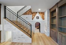
The team had more latitude indoors, where they not only ditched the decor’s overwrought and overscaled elements but also completely rethought its spaces. “We opened up rooms, moved rooms around and totally ignored the existing floor plan,” Tankersley explains. A new heart-of-the-home kitchen, for example, replaced a stingy cooking space, an undersized garage transformed into a high-style mudroom, an upper patio became a children’s playroom and combined living and dining rooms emerged as a single salon overlooking beautifully renewed gardens and grounds. “Almost every decision we made was to create a home that would be beautiful, fun, interactive, relaxing, uplifting and welcoming for kids, grandkids, friends and neighbors,” says Brandon LeRoy, principal of Jackson & LeRoy.
The designers masterfully tailored the interior to the owners’ tastes and lifestyle, pulling inspiration from many sources. Celebrating their clients’ love of art and travel, Johnsen and Rasmussen lined the walls of the newly reconfigured and refined entry with a soaring, floor-to-ceiling gallery of the homeowners’ impressive art collection. One painting depicting a Cape Dutch scene was recently acquired as a salute to the home’s existing Cape Dutch architectural gestures, including its facade’s shapely entry and elaborately scrolled corbels. Johnsen and Rasmussen took their lead from the painting as they fashioned a mix of informal fabrics, soft seaside colors, hand-painted Dutch tiles, European antiques and other curated elements that shape the light-infused interior’s freshly tailored, traditional décor. “The design nods to the historical, but is livable and informal,” Rasmussen says.


The designers masterfully tailored the interior to the owners’ tastes and lifestyle, pulling inspiration from many sources. Celebrating their clients’ love of art and travel, Johnsen and Rasmussen lined the walls of the newly reconfigured and refined entry with a soaring, floor-to-ceiling gallery of the homeowners’ impressive art collection. One painting depicting a Cape Dutch scene was recently acquired as a salute to the home’s existing Cape Dutch architectural gestures, including its facade’s shapely entry and elaborately scrolled corbels. Johnsen and Rasmussen took their lead from the painting as they fashioned a mix of informal fabrics, soft seaside colors, hand-painted Dutch tiles, European antiques and other curated elements that shape the light-infused interior’s freshly tailored, traditional décor. “The design nods to the historical, but is livable and informal,” Rasmussen says.
Although art takes pride of place, the home delights with unexpected details, room to room. White oak panels, for example, clad the living room’s apse-like fireplace wall while butter-yellow walls and a Dutch door cheer the butler’s pantry. In the small powder room, palm leaf wallpaper dresses the under-stairs space, a checkered stone floor rouses the mudroom and generously paned windows frame glorious garden views throughout. “The team focused on preserving much of the history and worked delicately to enhance, shape and beautify not only the home, but also the spectacular landscape along the Provo River,” LeRoy explains.


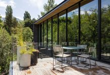
Linking the house with the riverside property presented yet another of the project’s notable challenges. “Architecture should have a dialogue with the land, and this house felt more like an object plopped onto the lot,” Tankersley says. “There was no conversation.” To establish discourse, he sent architecture out into the landscape, including new garages, that “put more chess pieces on the property.” He added a long, covered loggia connecting the main house with a spectacular courtyard imagined by Kaiser. There, a new pool, cabana and under-roof living spaces create a destination designed to satisfy the owners’ desire to live and entertain outdoors. “It’s amazing what Greg and Mike dreamed up,” Johnsen says. “They are a magical combination.”


Taking his lead from Tankersley’s architecture, Kaiser reengineered the front motor court, where he planted tall, mature trees “to calm the house down and give it some scale and age,” he explains. Kaiser installed other hand-selected trees to deliver shade and screening across the previously open lot. “We tried to focus on uncomplicated spaces, dense hedges, masses of evergreens and rows of trees to simplify what you see.” To encourage exploration, Kaiser wove a walking path through and around the land’s sprawling lawns, handsome structures and orderly gardens. “The property naturally has a lot of hidden corners discovered with surprise,” he says.
“Vital to the success of any project is to gather all the expertise and great talents up front,” LeRoy concludes. “This creates a beautiful symphony of creative minds working together.” Fortunately for the owners of this notable property, as well as the home itself, this collaborative team of masters pulled together everything needed to brilliantly renovate the resplendent estate.
Tour more home designs here.


