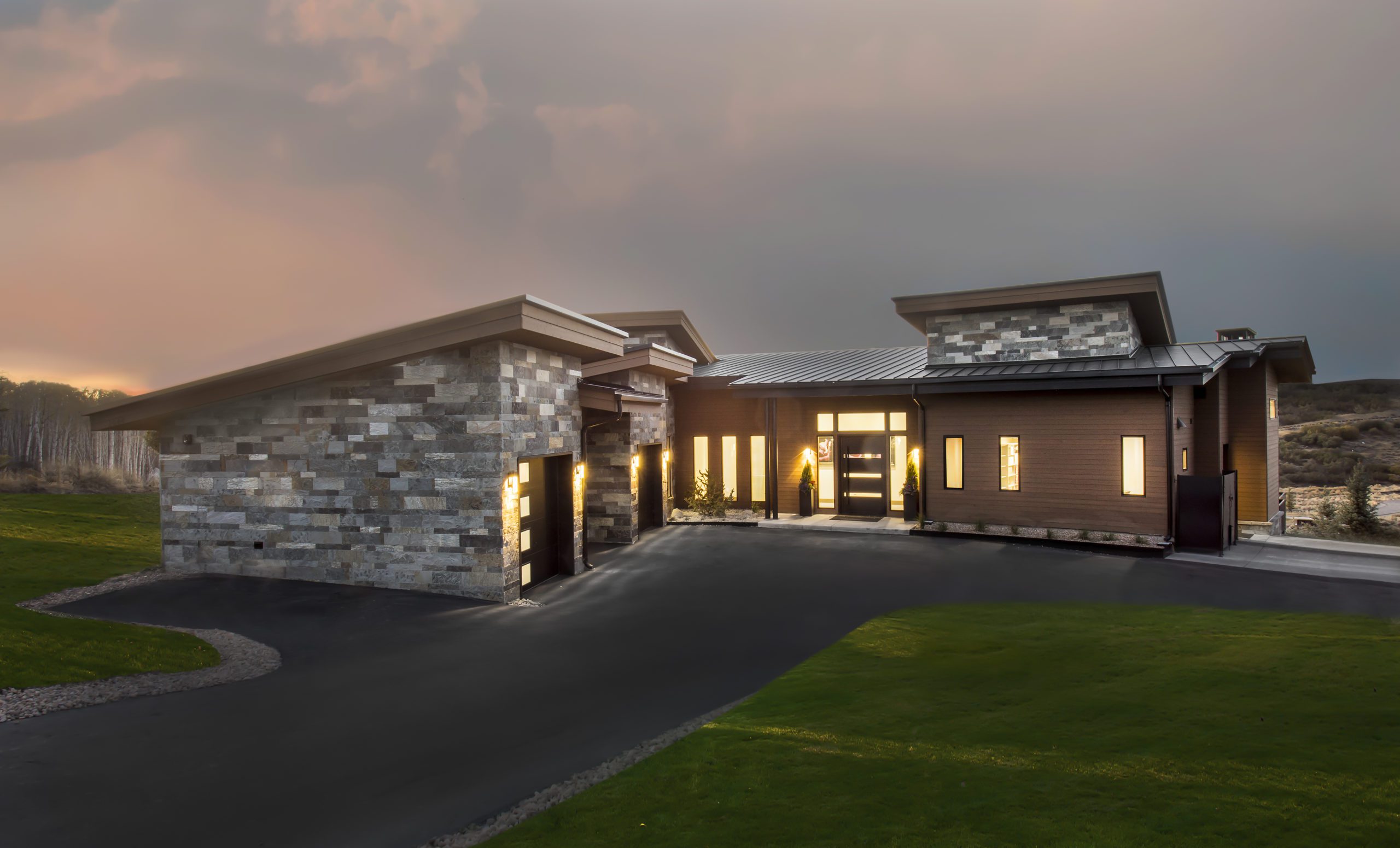
I recently returned to Promontory Park City to photograph a new home built by Upland Development (Ryan and Jesica Taylor) and architecturally designed by Bridgwater Consulting Group (Clive Bridgwater). My hope was I would get to hear the elk bugling one more time this fall, and I wasn’t disappointed. Their calls started just as I completed the last twilight exterior.

The homeowners consciously focus on healthy and balanced living, and while I couldn’t put my finger on just why, this home just felt good inside. The main living space is an open plan with definition given to the kitchen by the lowered ceiling and side walls. The opening to the left in the kitchen leads to the butler’s pantry and the one to the right connects with the bar and the entry. The white furnishings tie the space together, and crystals repeat in the interesting light fixtures. Elevated Interiors in Park City sourced the furnishings and collaborated on the interiors with the homeowners and Ryan Taylor.

From the fireplace, you can get another glimpse at how the areas coordinate and the use of natural fabrics and wood.

The kitchen is sleek and uncluttered. The waterfall kitchen island/bar has wood beneath to highlight the white shape. The butler’s pantry and a pantry room behind provide storage to the kitchen stays simple in appearance but has plenty of counter and workspace. The floorplan provides an easy flow for entertaining. To the right is a glimpse of the bar.

While the curve is subtle, the radius design can be seen in the left wall of the bar. The ceiling soars at an angle but the wooden frame anchors it lower so the room becomes more intimate.

The window wall by the bar opens to the outdoor dining and outdoor living area, which overlooks a wide expanse to the Uintas.

Here is the radius wall from the opposite side in the entry and the stairway.

Turning to the master suite, a fiery wall meets your gaze. It is built from salt bricks and is backlit. Standing by the salt bricks immediately soothed my airways and sinuses.

The master bedroom connects to a sitting area furnished with a chaise that looks out the glass to a private patio. It seems an idyllic place to read.

Returning to the master bath, here is a closer view of the salt brick wall. A steam shower divides the space with a vanity on each side.
In making the photos, I used available light and occasionally added some soft fill. The radius design added a challenge to the photo, as I had to take extra care in selecting straight lines for the cameral alignment.
Click here to read every Photo Friday.


