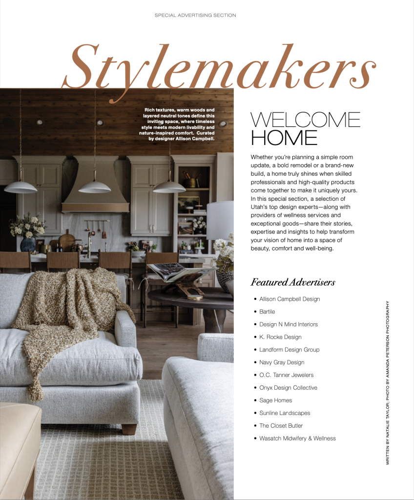
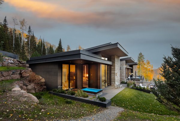
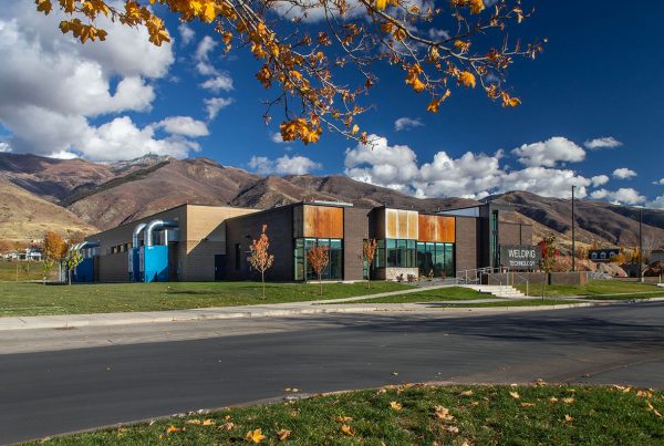
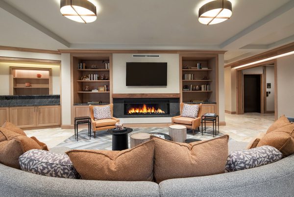
The glamorous powder room, an essential element of today’s home entertainment space, is certainly a step up from the humble half-bathroom.
It goes with the territory when you have done something for as long as I have been taking photographs of buildings and homes, that people ask about the changes over time. One big difference is the number of powder rooms I photograph now compared to when I started my career. They have changed from half-bathrooms and fairly insignificant spaces to places where designers and builders experiment with innovative and bold designs. (The opening shot is a Park City home by Upwall Design, Michael Upwall.)
Why the shift has occurred is an interesting question. Now, they are definitely an important part of the public space of the home where guests are entertained. The new upscaled designs honor guests and the finishes are in keeping with those of the entertainment spaces. From a practical standpoint, by providing facilities in the public area of the home for guests, it reduces the need for visitors to the home to venture into the private portion of the home.

This powder room has the appealing modernity that recalls something you would see in hospitality—like a high-end metropolitan hotel. I particularly like how the toilet tank is recessed and the faucets are flush to the wall. (Midway home by Hobble Creek Construction, Brian Bird & Spencer Johnson.)
There is some debate about why they are called powder rooms. One theory dates back to the wealthy estates of the 1700s when guests retreated to a room to refreshen their powdered wigs and to powder their faces. Another opinion moves it much later to the turn of the century when women powdered their noses and faces, freshening up. Early powder rooms were built under the stairway, off the kitchens, or in a small closet.

The tradition of small, windowless spaces continues, although I do see occasional exceptions. The small space means that expensive materials can be used, and because they are used in small amounts, you see splurges in fine stone and wood. (Park City Old Town home by Think Architecture)

By their nature of limiting water use to just a basin and toilet, designers tell me that for powder rooms they can use wallpaper without the risk of the steam damaging the adhesive. The shimmering gold in the wallpaper, the carpet with suggestions of an animal print, the sculptural tile, streaked stone, and the rounded-corned mirror combine to me to make an Art Deco impression. (Interiors by K Rocke Design, Kristen Rocke, and architecture by Inouye Design, Aaron Inouye)

Designer Cody Beale relies on the reflectiveness of the wallpaper to pick up the aqua tones of the light fixture for a playful, whimsical, and still classical powder room design in this update of a vintage Salt Lake City mansion.

The steely tones are warmed by wood in this masculine powder room that has a window. The window is shaded to lower light so that you can better appreciate the subtle variations of color and texture without any glare. To ensure this, I waited until dusk for the photo. (Built by Upland Development, Ryan and Jesica Taylor, and architecture by Clive Bridgwater)

For this Park City area home, the powder room combines natural elements. I am not certain of the backstory of the of the piece supporting the stone slab and basin, but I believe I overheard a conversation that it was found on site by the contractor and fitted for this use. (Built by Upland Development, Ryan and Jesica Taylor)

This elegant and compelling design has the components of carved scrollwork on the cabinets that continues through the drawer separations, variations in the countertop, a rectilinear basin that seems to frame the bowl, and a mirror with the same framing effect, but circular. One might have to visit several times to fully appreciate the details. (K Rocke Design, Kristin Rocke, and architecture by Lee Design Group, Ron Lee)

This Sun Valley home just won an award for enduring design, and it can be appreciated in the powder room with its minimal well-composed elements. The steel edging on the countertop adds a touch of bling, but the focal point is the art piece, selected by the homeowners. (Designed by Jack Smith, FAIA)

The stone and bright red cabinetry provides a bright accent in this Salt Lake City powder room, but like the one above, it is the artwork that leaves the impression. Who can ignore a scary clown?
It is interesting to me how much design innovation can be applied to a small room with a single vanity and a toilet. Certainly, I photograph the powder room on all my home assignments—they are important spaces to show the skills of the design team and builder. Because they are small and have mirrors, powder rooms can be a challenge to photograph and light. You want to see the materials and details, but no one wants to see my flash reflected, and certainly no one wants to see the photographer and his tripod and camera reflected in the mirror. With every shot, I learn.


