written and photos by: Scot Zimmerman
There are a number of homes in Park City’s favorite neighborhoods that were built 30 years ago and are showing their age. The rooms are confined and not linked in an open plan, the materials and color schemes are dark and heavy, there are too few windows and many are too small, the lighting is limited, and the detailing and finishes are dated.
Scott Jaffa, architect, of the Jaffa Group in Park City recently tackled updating one of these homes on the Park Meadows Golf Course. His before pictures validate the challenge.

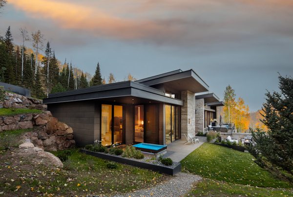
The exterior announces the home’s modernization with glass garage doors and a flat-plane roof extending out from the front door to emphasize the entry while offering the practical benefits of shade and deflecting rain and snow to make it more welcoming. The roof, stonework, wood and glass front door, and paned garage doors introduce horizontal elements that were previously absent in the design.


Inside, Jaffa’s goals were to create openness, connections, and more saturation of natural light. He eliminated walls around the former staircase and built a steel stairway with a light steel meshing to allow maximum transparency. The open floor plan flows from the family area off the kitchen through the kitchen and dining room to the living room and entry. One of my favorite designs that promote openness and transparency is the steel and glass cabinet cantilevered over the kitchen island that separates the kitchen and dining spaces.


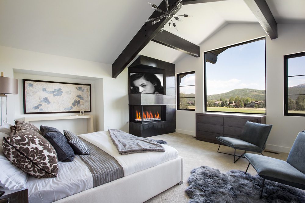
The new windows maximize light but the configuration also provides some privacy needed because of the home’s setting on the golf green. The white walls and ceilings reflect the light, and the wooden floors add warmth and sheen.


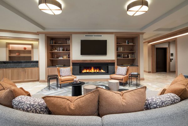
Dressed Design in Park City furnished and accessorized the home, including adding some large dramatic paintings from up-and-coming artists, which is one of Dressed Design’s and owner Beth Ann Shepherd’s signatures. The camel leather sofa and chestnut paired chairs have warmer tones than I have seen in a while, one of the trends in interiors that I find refreshing. The furnishings emphasize the modern direction set by Jaffa.

One of my measures of how good a job the architect and designer have done is the ease of photographing, An important consideration when taking architectural photographs is to avoid or deemphasize mistakes and awkwardness. By this I mean something out of scale, a large blank wall or floor space, cluttering, or transitions that aren’t smoothly done. With this house, every view was a winner—aim and shoot. A good day on the job.


