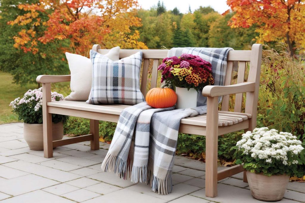
Full Circle: Dazzling Ring Chandeliers

A Parallel Large Studio Ring Chandelier by Hammerton Studio elevates the decor of a St. George home, created by Brian Geer Development & Construction, Liz Tate Design and McQuay Architects. studio.hammerton.com

Rounding out decors with their dazzling style, ring-shaped pendants and the ever-classic ring chandelier celebrate the beauty of the simple circle.

PHOTO ABOVE: A Parallel Large Studio Ring Chandelier by Hammerton Studio elevates the decor of a St. George home, created by Brian Geer Development & Construction, Liz Tate Design and McQuay Architects. studio.hammerton.com

Circle Chandeliers

Plunge Chandelier, curreyandcompany.com

Eclipse Pendant by Fran Taubman, ralphpucci.com

Circle Chandeliers

Versailles Chandelier by Atelier Alain Ellouz, hollyhunt.com

Circle Chandeliers

Ardesia Circular LED Pendant, hubbardtonforge.com

Sonoma Chandelier, alicelanehome.com

Circle Chandelier

Rotondo Chandelier, paulferrante.com

Quebec Chandelier, hvlgroup.com


Explore more local products here.

Polished Nickel vs. Chrome: What’s the Difference?

Silver toned metals read confidently cool in a provocative decor recently imagined by Alice Lane Interiors. So when debating polished nickel vs. chrome for your finishes, how do you select which is best? Creative Director Jessica Bennett shares the secrets to using cool metals here and in other chic interiors she and her team create. 

Polished Nickel vs. Chrome

Nickel and chrome are both resilient finishes and are created similarly, plated onto brass and polished to a shiny, smooth and mirror-like surface. In the decor debate the key difference is the temperature of their tones.

Chrome is typically colder with a somewhat blueish tint, while polished nickel is warmer and reads slightly yellow. Because of their high sheens, both need to be wiped clean if and when they are handled. Nickel is generally more expensive than chrome and can tarnish over time, but a lacquered finish slows the process. Brushed nickel, a designer favorite, eliminates smudging and fingerprint worries. Chrome is more affordable. If it is damaged, it can dull and any inferior plating can result in flaking, leaving the core metal open to rust.

“N​ickel is always safe, particularly polished nickel because it provides more warmth than chrome. And it doesn’t sway in being universally beautiful, no matter the trend.” 

– Jessica Bennett

Which is the best fit for your home?

House Tour: Personal Touches Abound in The Flairhunter’s Park City Family Home

Designer Stephanie Hunt combines bold color, whimsical elements and beloved vintage and modern finds to brilliant effect in her family’s new Park City abode. Photos by Mellon Studio.

Whether she is creating a space for her own family or designing homes for clients in Park City and Southern California, designer Stephanie Hunt—aka The Flairhunter—believes the magic is always in the mix: old and new; high and low; bold and subtle; funky and refined. Case in point: She adorns her walls with vintage Hermès scarves and retro skateboard decks with equal aplomb. “Life is serious; designing it should be fun,” Hunt says of her creative philosophy (and, appropriately, her business tagline).

The home’s hallways were designed as art galleries with glass enclosures on one side to allow for natural light and white walls on the side for displaying pieces from the Hunts’ large art collection, which were placed specifically and deliberately during the architectural phase. Photo by Mellon Studio.

Fun was the name of the game when it came to creating a dream dwelling for Hunt and her husband, Brandon, with plenty of space to accommodate their two sons, both in their 20s, when they come to visit. After selling their beloved family home in The Colony, the Hunts purchased a 5-acre property closer to town on Old Ranch Road in Park City. “The lot with the big red barn,” says Hunt, referring to the property’s former local landmark. The couple began working with an architect, but the project hit the brakes during the pandemic. They eventually resumed building with a new architect at the helm: Solim Gasparik of 4CDesign Group.

They decided to build three different structures on the sprawling property. The main residence is a large, Scandinavian-esque modern farmhouse with long, glass-enclosed hallways that act as galleries for the couple’s large collection of artwork. The design was inspired by a trip the Hunts took to Reykjavik, Iceland. “I fell in love with the simple, barn-like structures and homes there,” says Hunt. “I wondered what it would be like to have ‘pods’ or pavilions connected by halls or breezeways so that each section was a different part of the home.”

It’s safe to say their current abode is anything but boring. Bold color, pops of pattern, eye-catching tile, playful art and sentimental pieces are signature to all of Hunt’s homes, and this one is no exception. A palette of blonde wood floors, vanilla-hued walls and dark exposed beams are punctuated with moments of color throughout.

Eye-catching tile is a hallmark of Hunt’s designs, and this green Syzygy Tile kitchen backsplash is no exception. “I found it two years prior to building the house,” the designer says. “Because the kitchen is so open, I designed everything else to work with the backsplash. Photo by Mellon Studio.
The great room is opposite the kitchen, so Hunt ensured the colors and concepts were coordinated. She sourced the giant retrofitted factory lights on one of her antique/flea market treasure hunts. The dramatic stone surround fireplace was a keydesign element—board and batten extends from the top all the way to the ceiling and peak of the roof. Photo by Mellon Studio.
In the soaring kitchen/great room, blonde floors and white walls are juxtaposed with dark exposed beams. Clerestory windows allow for plenty of natural light and give the space a cathedral-like quality. While working with her architect, Hunt created specific spots for beloved salvaged pieces, like a vintage airplane propeller, train station clock and crusty pendant lights. “I love old things in a new home to give it a soul,” she says. “I want a home that has some patina and character.” Photo by Mellon Studio.

In the massive combined kitchen/great room, for example, a turquoise-green glazed Syzygy Tile backsplash in a geometric, dimensional pattern informed the look and feel of the rest of the space.

A brightly hued Hermès scarf inspired the design of the primary bedroom. “I bought it in Paris and had it framed,” says Hunt. “It inspired all the colors in the room.” The scarf hangs above the bed, set against a dark green plaster wall.
Photo by Mellon Studio.
Hunt designed the primary bathroom from the ground up—the floor features three tones of green tiles in a random chevron pattern. “It’s perfectly imperfect,” she says, referring to Wabi Sabi, the Japanese concept of beauty in imperfection, one of her favorite design principles. She purchased the cheeky “Get Naked” sign hanging above the Native Trails slate tub while on a trip to London.
Photo by Mellon Studio.

In the primary bathroom, Hunt chose three tones of green tiles laid in a chevron pattern for the floor. “Green is my spirit color,” she says. “I always think of green as a neutral. It doesn’t clash with any other color—just look at nature.”

“I wanted the powder room to be a bit zany and irreverent,” says Hunt. With that in mind, she chose a patterned, multicolored wallpaper with snakes, jungle cats and greenery. The floor is a riff on a traditional checkerboard design but is actually made up of mosaic tiles. Photo by Mellon Studio.
Hunt paired clean-lined, blonde wood stairs with a vertical, steel black powder-coated railing. She chose white walls to showcase a trio of framed vintage life preservers—a nod to her California roots—and other sentimental items. “I love using objects as art,” she says. The light fixture was custom-designed in San Miguel de Allende, Mexico. Photo by Mellon Studio.

Elsewhere in the home, a powder room is dressed in a wild, patterned wallpaper peppered with jungle cats, snakes and greenery. Unexpected objects framed as art are hung on various walls, including vintage life preservers, swim fins and a surf flag—all nods to the couple’s California roots.

In Hunt’s home office, artwork by her sons hangs alongside paintings from local galleries including Julie Nester Gallery, Gallery Mar, J Go Gallery and A Gallery. The oversized tumbleweed light fixture is from Summit Gallery in Park City.
Photos by Mellon Studio.

And in Hunt’s office, a taxi-cab yellow Smeg fridge (another favorite hue), an oversized tumbleweed pendant light and a wooden swing suspended from the ceiling all speak to her playful, more-is-more design ethos. 

“People get hung up on what’s on trend or what color is popular, but if you love it, that’s what matters,” she explains. “I love whimsy and I love humor. Why shouldn’t your house be fun?  

Hunt’shome was inspired by the simple, barn-like structures she fell in love with while traveling in Iceland. The dwelling has dark gray vertical siding, steep gabled roof lines, touches of gray stone for texture, and very minimal fascia and eaves. Photo by Mellon Studio.

The property’s two additional structures include a freestanding barn that serves as Hunt’s office and design studio, and a new big red barn, rebuilt in homage to the original.

Now dubbed “the fun barn,” Hunt had custom climbing walls and a mini halfpipe skate ramp built inside for her sons and their friends to use. The property also features a pool, Bocce court, two fire pits, 600 newly planted trees and various seating areas with sweeping views of the surrounding ski resorts.

The dining room is around the corner from the kitchen in a separate, quiet space. The room features a vintage Italian light fixture, framed charcoal etchings that belonged to Hunt’s parents and white linen dining chairs draped with faux-fur throws to create a cozy vibe in the winter. Photo by Mellon Studio.

While the architecture of the couple’s new dwelling is somewhat subdued aesthetically, the interiors are quite the opposite. “I’m not a minimalist,” says Hunt. “It’s not me. It’s not us. I tried the sophisticated, neutral look, and my husband said, ‘This feels boring.’” See more full-of-flair spaces:

Left:

Above:

Right: 

Opposite:

Opposite: 

Above: 

Top Left: Hunt’s home was inspired by the simple, barn-like structures she fell in love with while traveling in Iceland. The dwelling has dark gray vertical siding, steep gabled roof lines, touches of gray stone for texture, and very minimal fascia and eaves. 

Bottom Left: 

Opposite:

Photo Friday: Millcreek City Hall and Community Space

The City of Millcreek, incorporated in December 2016, completed a city hall adjacent to the Millcreek Common in the new city center.

Newly incorporated, the City of Millcreek (comprised of the areas we commonly think of as East Millcreek, Canyon Rim and Olympus) set  a vision for its town center in its general plan that called for it to be included in an area designated for public use; to make it a true hub, heart and center connecting residents; to emphasize culture, art, ideas and citizen interaction; and to be distinctive from other cities’ city halls and unique to Millcreek. A tall order! MHTN Architects worked on the city center master plan and designed the new city hall, and Okland Construction just completed construction.  

Millcreek Commons adjacent to city hall has an ice ribbon that is the State’s largest outdoor ice arena. It transforms in the summer for roller skating. A bench/fire table provides a place to sit and watch the skaters with the luminous new city hall beyond. 

Connections mark the design: to the outdoors, the Commons, streetscape, patios, and balconies. Distinctive in its design, the form on the right suggests a traditional clock tower but is a climbing wall. The community spaces are the public market, café and restaurant on the ground floor and the glassed reception area top (6th) floor. Unseen on the roof are solar panels. A precinct for the Unified Police Department occupies the third floor and offices and conference rooms for city personnel are on the fourth and fifth floors. 

The glass walls of the main-level community space provide transparency and views to the Wasatch, including the mouth of Millcreek Canyon and the toe of Mount Olympus, parts of the city. The ceiling over the seating area rises to two levels with a lower ceiling over the market space. The public market seen in the far-left features stalls for Utah’s Own, a state program that connects consumers directly with Utah products and produce. 

On the ground level are areas for a café and an incubator restaurant. The roll-up door opens to a patio. 

From the bridge hallway on the second level, you can look down to the community space below and out for an aerial view to the Wasatch. On the right is a gallery wall, and as you walk the hallway, it leads to a reception area for the police and city offices and proceeds on to the council chambers. 

Outside the Council chambers is an ante room, a nice place to stretch your legs during a lengthy meeting.

The Council Chamber features the latest in electronics, a long window wall with views to the east, and generous space for the constituents to seat, reflective that there are over 63,000 people in the city. 

At the top, on the 6th floor, is a large ballroom style reception room. This reception space can be rented for parties and events and enjoyed by the people of the city. The wood paneling and ceiling add a warmth, and the glass makes for incredible views. At the far end are doors that lead to an outdoor space. 

I made these photographs in December, not long after the November 30th opening celebration. Whether or not to photograph a space with holiday decorations is a frequent discussion I have with clients. My answer is that it depends on whether the decorations detract from understanding the forms, materials, flow, and feel of the building. In this case, my opinion is that they add a warmth and a sense of occasion and celebration without detracting. I would be interested in your thoughts. 

See more Photo Friday content here.

Into the Blue: Fresh Blue Paint Colors

With their 2024 Color of the Year picks, designer paint brands predict our rooms will be hitting a blue note as they move away from stronger, warm-toned colors trending during the past few years. 

Blue Nova by Benjamin Moore

“An alluring mid-tone that balances depth and intrigue with classic appeal and reassurance.”

Skipping Stones by Dunn Edwards

“A serene and steely blue with hints of green and ray is meditative and energizing like the sea.”

Upward by Sherwin-Williams

“A breezy, blissful blue: The color found when we slow down, take a breath and allow the mind to clear.”

Renew Blue by Valspar

“A nourishing, green-influenced blue that creates a sense of peace wherever you place it.”

Ready for more than just new blue paint colors? Get more color inspiration for your home here.

House Tour: An Avenues Condo Gets the Tres Chic Treatment from AMB Design

With visions of Paris in her head, designer Anne-Marie Barton leads a team to transform a stripped-out condo into a massterful composition of modern sensibilities and timeless tradition.

Close your eyes and imagine a modern Parisian apartment with French doors flung open to dazzling city views. You’re envisioning high ceilings, light plastered walls and beautiful wood floors, perhaps? Stately moldings, maybe, with statements of marble, brass and sculptural lighting woven throughout? Indulgence and restraint merge as framed art and bespoke furnishings fill the home with chic, personal style. This is exactly the mix fashioned by designer Anne-Marie Barton as she teamed with contractor Steve Dubell and architect Brian Junge to transform a gutted, two-story dwelling into the unique and luxurious residence their clients desired. “It’s a combination of traditional and classic lines with more modern sensibilities,” says Barton, describing the interior. “This mix is what makes it feel Parisian modern and so authentically European.” 

The two-story home is located in The Meridien, a development of luxury condominiums built within the shell of the old Veterans Administration Hospital located in the Upper Avenues neighborhood high above Salt Lake City. When the team first encountered the space, it was little more than a brick shell with windows and concrete floors. There were no interior walls, finished ceilings, electrical or plumbing. “It was completely stripped out,” Dubell recalls. 

Arched double doors, quartz chandeliers and facing fireplaces foster the salon’s comforting symmetry, while mixed furnishings and separate spaces subtly offset the balance. White oak floors by Burchette and Burchette. Photo by Joshua Caldwell.

To begin the cavity’s dramatic transformation, Dubell created the home’s outer walls inside the existing brick structure. “It was like building a box within a box,” he explains. The team lowered soaring ceiling heights to make the spaces feel more comfortable and orchestrated an artful mix of enclosed rooms and flowing open living areas to fill the interior’s two levels. “Our clients wanted openness with connected, intimate spaces,” Dubell explains. In response, the team defined some rooms with conventional walls. But for others, they employed architectural features including ceiling details and moldings, column placement and even interior glass walls to suggest separate areas—all to foster openness while capturing interior views. “We wanted to see and experience the drama and beauty from every point,” says Barton, who also fashioned furniture groupings and positioned lighting, rugs and art to define open yet separate living zones. “I used the delicacy of the ceiling’s applied molding patterns to gently echo the room shapes within the open spaces and grounded them from below with the foundation of rich cashmere and mohair rugs.”

A chandelier by Andreea Braescu hangs above a live-edge dining table. The open space allows views into the breakfast area richly furnished with a round table, chairs and a curvaceous, Holly Hunt mini sofa. Photo by Joshua Caldwell.

Before considering her projects’ furnishings and finishes, Barton focuses on transforming raw spaces into luxury living as she conjures floor plans, wall placement, fireplaces, interior doors, windows, cabinetry, kitchen and bathroom design and more. Here, the designer did exactly that as she struck the perfect balance between the home’s expressive architecture and the sense of modern elegance and intimacy her clients craved. For example, the salon—composed of the open kitchen, dining and twin living room areas—is equally suited for entertaining and gathering as well as enjoying private moments of quiet contemplation. 

The salon’s “more expected” conversation area “allowed us to go off the hook with the opposing biomorphic arrangement across from it,” Barton says. Art by Cédrix Crespel. Photo by Joshua Caldwell.

Barton fostered comforting symmetry by appointing the room’s facing conversation areas with matching elements, including stone-and-brass fireplaces, thick textural rugs and quartz crystal chandeliers. Their furnishings, however, are unlike in style, shape and composition. Clean lines, simple silhouettes and a more conventional arrangement characterize one, while sensuous curves, biomorphic forms and a fluid setting define the other. “The lux, organically shaped sofa and sectional are so unique,” she says. “I love adding a touch of curiosity or the unexpected to my projects.” Nature-inspired shapes, in fact, appear throughout the interior, evoking emotion and fostering a sense of flow between the indoor and the outdoor spaces. “Subtle ingredients that reflect nature are my secret to designing interiors that appeal to the senses,” the designer explains.

Custom glass office walls manufactured by Metamorphic, boast uniquely small and flat mullions, making them more refined and European. Inside, custom cabinetry and a desk by Christian Liaigre furnish the husband’s customized work-and-listening space.

The owners wanted their home to perform as an art gallery of sorts, so Barton created opportunities for their favorite pieces and designed a gallery walk toward the private wing of the home with a near-neutral backdrop that allowed the art to do the talking. “I couldn’t introduce a lot of color, so I relied on texture and shapes to deliver interest and intrigue,” she explains. Wire-brushed, white oak floors and plastered walls give way to a plush boucle-dressed sectional while mohair-covered sofas team with walnut tables and bronze accent pieces. Jaw-dropping sculptural lighting animates the decor—another way Barton elevated the design with spirited forms—while beautifully veined stone romances the interior at every turn.

The designer also created a subtle thread of harmonious neutral tones and muted naturals that carry throughout, unifying the decor. Creamy whites, soft taupes and barely-there beiges dominate the walls and window coverings. In the light-walled salon, for example, translucent draperies softly patterned in whispered shades of cream, silver and aubergine create a dreamy backdrop for warm-white seating and ethereal chandeliers. Barton saved darker hues like charcoal, bronze and ochre for accents in upholstery, wallcoverings and decorative accents. An encore of more exuberant hues appears in the original art. “This home allowed me to place strong elements that, in many ways, appear to have been in the space forever,” she says.

The chic entry is dressed in metallic ombré Horsehair wall covering by Phillip Jeffries, while the deep window covering is framed in brass, all crowned with a shapely Ralph Pucci Pendant designed by Ted Abramczyk. Photo by Joshua Caldwell.

One of Barton’s fortes is creating and conveying luxury, and this project is no exception. A freeform-shaped chandelier from Ralph Pucci illuminates the entry cloaked in a metallic ombré horsehair wallcovering. Slabs of elegant stones form the kitchen’s range hood and master bedroom fireplace. Sultry smoked glass frames in a bathroom’s shower and toilet rooms, undulating brass sheathes fireboxes, quartzite forms a fluidly integrated kitchen sink and a porcelain-leaved pendant floats like a ginkgo branch above the live-edge dining table. The list is long. “I live off the ideology that anything practical can be beautiful,” Barton explains.

The result is a home that harmoniously merges timeless European elegance with modern aesthetics and livability. Ten months after the remarkable transformation began, the homeowners moved in and began enjoying the life that they envisioned within the masterfully imagined spaces.  

See more beautiful spaces imagined by Anne-Marie Barton here.

Editor’s Note Winter 2024: A Nice Touch of Texture

As little kids, my two brothers and I battled winter boredom by using our home’s carpeted staircase as a downhill race course. Beneath the landing’s smoked-glass chandelier, we’d sit side by side on pillows, perched atop the flight of gold-shag-covered stairs below. With a unified “go,” we’d push off the top step, propelling ourselves into a back-jarring, elbow-throwing descent that ended with us in a howling heap on the hallway floor. After untangling ourselves, we’d race back to the top of the flight for another run. This would go on for hours, or until our parents broke it up for fear of fractured bones and threadbare carpeting. 

Then one day, a burly man in white coveralls showed up with a long folding table, a bucket of goop and rolls of paper tucked under his arm. By that evening, our white-walled race course had been transformed into a swanky space sheathed in shimmering metallic wallpaper finished with thick swirls of velvety flocking. 

With martinis in hand, my parents looked on approvingly as Dean Martin crooned in the background. We boys were less enthused. The fancy update totally changed the disposition of our rough-and-tumble race space. But before long, we succumbed to that wallpaper’s textural allure. The excitement of running our grubby little hands along the undulating flocking and foil while racing down the thickly carpeted staircase was irresistible. It became a daily event. Unfortunately, Dad and Mom didn’t appreciate our heightened attraction to the staircase, and they banned the competition permanently. 

Decades later, texture still thrills me and I’m not alone. This issue is packed with design pros who embrace texture’s tactile and visual qualities to elevate the look and feel of the spaces they create.

As showcased on the cover, designer Anne-Marie Barton teamed nubby boucle-covered seating, whispery sheer draperies and glistening rock crystal chandeliers to create alluring, hands-on luxury and to connect the room to nature. Inside these pages, Carrie Delaney chose natural stone, oak paneling and a grasscloth wall mural to warm a Victory Ranch decor, while wooly textiles and reclaimed wood-clad walls become heroes in a Deer Valley interior dreamed up by Danielle Domichel Hickman. In snowbound Park City, Stephanie Hunt channels her love for textural interest with glazed, “perfectly imperfect” tile and an oversized tumbleweed chandelier, and our avian-inspired fabric feature celebrates winter’s textural palette and artistry. 

Page after page, this issue puts us in touch with texture’s power to transform any decor, even yours. Are you feeling it? 

Flip through the first issue of 2024 here.

Ahh Nuts! The Best Nuts for Entertaining Appetizers

Rich flavors, comforting aromas and versatile pairings—if roasted nuts have a season, we’re in it.

How to Roast Nuts for Snacking

You can roast nuts in the oven, on the stovetop or in the microwave. The only trick is watching them carefully. Nuts go from brown to burned in seconds. For all these methods, spread the nuts in an even, uncrowded layer and remove them from the pan as soon as you take them off the heat. Otherwise, they can continue cooking.

Microwave: Use a glass plate and microwave the nuts in one minute intervals, tossing them between each minute.

Oven: Preheat your oven to 350 degrees and spread the nuts on a baking sheet. Timing varies from about five minutes for pine nuts to 15 minutes for peanuts. Most nuts take about 12 minutes, but be warned, keep an eye on them so that they don’t burn.

Stovetop: Put a dry skillet over medium heat and add the nuts when the pan is hot. Stir them often to prevent burning. 

Perfect Nut Pairings

Nuts+Vegetables = a combo made in flavor heaven. Whether in a charcuterie board or as a stand alone dish, these pairings are sure to impress.

Nuts are high in fat and relatively high in protein, meaning that they are ripe for the Maillard reaction, which explains the distinct flavor that comes from browning foods. It’s no wonder the addition of toasted nuts—to vegetables especially—lends substance, mouth feel, umami and satisfaction to leaner, more austere flavors. The classic example is green beans amandine, but there are other great vegetable-nut combinations (a little added butter never hurt anything, either). 

• Stir-fry spinach and toss with toasted cashews

• Sprinkle toasted walnuts over roasted
butternut squash

• Mix Brussels sprouts with toasted
hazelnuts

• Garnish cauliflower with toasted pine nuts

• Top sweet potatoes with toasted pecans 

6 Inspiring Ideas for Your Living Room Details

Try your own take on these 6 finishing touches for your living room.

Designer Margaret Anderson teamed with Nancy Van Matre, owner of Cosy House, to accessorize the space with warmth and character.

Pile On the Pillows

As pictured above, Anderson and Van Matre layered pillows and throws on the sectional to foster a sense of relaxed luxury while placing their warmth and comfort just an arm’s reach away. 

 Speak Volumes with Curated Books

“I absolutely love books,” says Margaret, who fills her own home with favorite titles. Here, books are stacked, displayed and used as platforms to deliver style and personality to tables and shelves. 

 Fire Up with High Style Candles

Van Matre grouped tapered candles and brass stands of varied heights on the coffee table. “The different heights create dimension and a layered look,” she says. “And I love their ochre color—it goes with everything and is perfect for fall.” 

 Weave Around

Woven elements—from baskets and coasters to the nearby dining room’s cane-back chairs—deliver rich texture and natural fibers. Plus, the baskets provide easy spots to stow remotes, small books, magazines and other cluttery objects. 

 Add a Little Light – Lamps are Key

Two small lamps illuminate the inside of the shelves, creating soft pools of light that animate the displays. “I love their glow,” Van Matre says. Margaret agrees, “These are much warmer and softer than library lights or strips of lights applied to the underside of shelves.”

 Go Green (Or Any Color)

A mix of fresh and faux greenery enlivens the decor. Van Matre prefers leafy faux greenery without flowers for year-round use­, and for autumn, she dials down the brightness. “Richer and darker hues like those of olive branches and magnolias are perfect.”

See the full living room design here.

A Light Touch: Stylish Candle Snuffers for Winter Accessorizing

Proving that small details can make a big impact, this antique-inspired candle snuffer delivers an elegant silhouette to today’s beautifully composed tablescapes and mantels. Poised and purposeful, it serves as a stylish symbol of refined taste and a tribute to the ritual of kindling and silencing flickering flames.

Pictured above: Antique brass candle snuffer, $49; crystal diffuser dish, $47; scented candle, $49, Alice Lane Home Collection, Draper, alicelanehome.com

ILLUME Black Candle Snuffer, $16; Crate and Barrel, Murray, crateandbarrel.com

Polished Brass Candle Wick Trimmer, $20; Terrain, shopterrain.com

Forged Wick Snuffer, $18; Alice Lane Home Collection, Draper, alicelanehome.com

Snuffer and Trimmer Gold Set, $29.95; Williams Sonoma, SLC, williams-sonoma.com

Get more ideas for your home this winter here.