In Salt Lake City, a classic mid-century modern home catches a big break when its hands-on owners team with talented pros to give it a magnificent makeover.
By Val Rasmussen, Photos by Scot Zimmerman

The facade received a facelift with a two-car garage, floor-to-ceiling windows in the entry and a spacious walled courtyard featuring an ipe wood rain screen.
It all started with a knock. Standing on a dusty stoop 10 years ago, young attorney Lee Saber waited patiently for the door to open. He and his wife Hadley had recently left a small yellow cottage in Austin to return to their hometown of Salt Lake City, and behind that door they hoped to find the beginning of the next chapter of their life together.
The couple stumbled upon the run-down rambler while on a walk in the Salt Lake Country Club neighborhood. “The house was completely concealed with trees, ivy and vines,” Lee says. But it showcased a key feature they coveted: a flat roofline. “Fifteen years ago, mid-century modern design was booming in Austin and we really liked it,” Hadley says.
As luck would have it, the 85-year-old homeowner was interested in selling. “We knew it was jewel in the rough,” she says. “We were in our late 20s at the time and the thought of renovating appealed to us.” And with that, the couple purchased the property and began to transform it.
“Our first priority was the landscaping when we moved in,” says Hadley, who with Lee, excavated the yard and designed its new features. Dumpsters were filled with uprooted shrubs, ivy and trees. The pool was updated, and overgrown vines were stripped from a tall fence enclosing the property to reveal views of the golf course’s 6th hole adjoining the yard.


Anchored by a new kitchen, a series of living spaces are united by streamlined, custom cabinetry, wood floors and a series of broad windows opening to the backyard.
Today, Lee and Hadley—along with 9-year-old son Jack, and 7-year-old daughter Beau—flourish in the hip home that took 10 years of thoughtful planning and six solid months of major renovation to create. With the help of architect Monte Still of Still Thorum Architecture and builder Brady Sherman of Sherman Homes, the Sabers transformed the 3,545-square-foot ranch—originally designed by architect Ed Dreier—into headquarters for their family.
“Ultimately, we tried to update the house in the way Ed would have,” Lee says. “With the invaluable help of our architect, Monte Still, we remodeled the house without sacrificing its original character.”
Upon arrival, guests pass through an extra-wide, glass pivoting door that opens to a view of the backyard and, to the left, a glimpse into an office enriched with eye-catching custom cabinetry designed by Bill Cordray, space designer for Teerlink Cabinet, whom Still enlisted to engineer the look and flow of custom cabinets. Just as the office serves as an initial visual treat for guests, the mudroom/pantry area performs similarly for the homeowners.
“Many design projects don’t consider how the homeowner enters the house,” says Cordray. “We wanted them to walk into a mudroom that looks nice and functional.” Inspired by mid-century modern furniture, walnut was Cordray’s “obvious” material choice here and throughout the house.

Book-matched in the center of the island, the grain of the walnut cabinet doors runs horizontally emphasizing the lines of the mid-century architecture.
Featuring walnut on every cabinet face wasn’t the only savvy design choice Cordray made. By varying colors of cabinet frames and doors in each area, the spaces link without excessive duplication. This is most apparent in the kitchen where walls were removed to open it to the adjoining living and dining areas. “The interplay of the two-tone treatment gives it much more of a custom look,” says Cordray. “And it lightens it up a bit, especially around the refrigerator and oven which can look heavy on the same wall.”
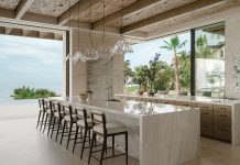
Calacatta gold marble topping the kitchen’s 12-foot island also lightens the space. Beyond the island, the eye moves to the most striking feature of the renovation: thirty feet of floor-toceiling sliding windows that meet at the great room’s corner. There, the Sabers enclosed a roofed outdoor patio, providing an extra 275 square feet of year-round living without adding to the footprint. “We were really inspired by California design with the open walls of windows that bring the outdoors in,” says Hadley. “And the windows are their own pieces of artwork.”
A work of art, indeed. Focusing on views and an open floor plan allowed the Sabers to preserve the era of the home while adding modern-day functionality and contemporary custom finishes. “We envisioned the end result for a decade before we actually embarked upon the remodel,” Lee says. “We knew exactly what we wanted from the remodel process and it has been rewarding to have our patience pay off—especially after living in the home’s original condition for 10 years.” All this beginning with a simple knock on the door.


