Written by Brad Mee | Photos by Scot Zimmerman
So what if the kitchen was cramped and parts of the floor plan were as compartmentalized as a maze? Built in 1940, the single-level ranch house located in Salt Lake’s historic Yalecrest neighborhood oozed potential. Ben and Taylor Brown recognized the dwelling’s possibilities and sought a team of pros to turn the old house into a spectacular new home for their young family.


The job went to contractor/design team Tom and Cara Fox and architect Warren Lloyd, who collaborated with the Browns to renovate and renew the house designed by early Utah modernist Slack Winburn. The goal was to retain its original charm, enhance its elegant features, update the interior and create a large family kitchen and a second story to house a master suite and kids’ bedrooms.

Impressively sited, the colonial ranch home sits above the street and back on a large, pie-shaped lot overlooking the historic neighborhood. “When you talk curb appeal, there’s a lot of curb here,” Lloyd jests. And that’s exactly where the transformation began.
Replacing a grass-covered slope bottoming out at the street, a low wall, broad walkway and level yard now front the stately, two-story house. Swathes of hydrangeas and white roses overspill boxwood hedges while shaped trees and lush lawns comprise a formal landscape designed by Emily Brooks Wayment. These glorious gardens and the home’s new exterior details—including a cedar shake roof, copper rain gutters and traditional dormers—hint at the dynamic design waiting behind the front door.

An original elliptical foyer welcomes guests with its distinctive shape and refreshed décor. “We wanted to keep this space because it is so unique to the house,” Tom says. Here, he and Cara began their infusion of time-honored elements and masterfully continued them throughout the remodeled home.
 Beautifully crafted architectural detailing prevails. Stately paneling, generous moldings, handsome casings and elegant millwork deliver dimension and classic character to walls, ceilings and custom built-ins. White oak floors perform like art underfoot, boasting centuries-old patterns. A palette of muted colors, from rich blue to dark gray and whisper-soft whites, provides depth and continuity throughout the interior.
“We take historically inspired concepts and incorporate them into modern day living,” says Tom. “These layered treatments make our homes timeless, sophisticated and unique.”

In the north wing of the house, herringbone-patterned white oak floors, large windows and traditional paneling define a wide gallery hall. These eye-catching features draw attention away from modest 8-foot high ceiling,” says Tom, describing the savvy strategy he used throughout the low-ceilinged main level. The light-filled hall opens to a number of beautiful rooms, none more alluring than the combined living and dining space.

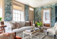
High-gloss gray-blue paint envelopes the formal room with saturated color while leaded glass windows, a coffered ceiling, paneled walls and original masonry fireplace fill the space with sophistication and timeless style. “It’s our favorite room in the house,” Cara says. Nearby, a darkly painted office—replete with a geometrically patterned wood floor, paneled walls, fireplace and curved leaded glass windows—offers a quiet spot to retreat. At the end of the hall, a stylish playroom and a new home theater spectacularly built into the existing rotunda (with a gym located beneath) provide casual, finely finished spaces for the family to play and relax.
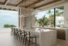
 The opposite end of the home showcases the most dramatic changes to the original structure. Several choppy rooms, including the original cramped kitchen and small bedroom, were reconfigured and replaced with an open family room, kitchen and dining nook that distinctively join on the diagonal. “This is not your typical box,” Tom jests. A 17-foot island anchors the spacious kitchen, where an Italian brass sink, brass lanterns and a custom brass hood backed by a single slab of Calacatta gold marble bedazzle the room. “We chose unlacquered brass for its timeless finish,” Cara explains. Custom cabinetry by CS Cabinetry fully furnishes the room despite the fact that no upper cabinets were included in the design. “Uppers would have drawn attention to the low ceiling,” says Tom. Instead, lower cabinets, a full pantry wall and a hidden door leading to a working pantry provide plentiful storage.
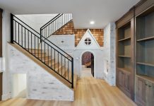
Crowning the remodeled kitchen area, a dazzling ringed chandelier drops from an open, second-story addition, where the master suite and kids’ rooms reside. A beautifully crafted stairway is discreetly located off the kitchen and provides ideal access from the upper level directly into the active kitchen and family room areas. “It’s an extremely functional design for the family,” Tom says.
 The 1940s house now enjoys a new life as a timelessly styled, functional home for the Brown family. What’s more, it looks and feels like it has always been that way. “With most of our remodels, the goal is to make an old house feel and work like new and still look old,” says Tom. “It’s not easy, but when we accomplish that, then know we’ve done our job.”
Sources:
Architect: Warren Lloyd, Lloyd Architects, SLC
Interior Design: Cara and Tom Fox, The Fox Group, SLC
Contractor: Tom Fox, The Fox Group, SLC
Landscape Design:Emily Brooks Wayment, Trellis Design City, SLC
Custom/Built-In Cabinetry: Christopher Scott Stinson, CS Cabinetry


