Architect and designer Ron Godwin’s task was both challenging and inspired: to update and expand an outmoded 1958 mid-century home by famed architect Ed Dreier while retaining its flavor, satisfying current building codes and meeting the functional needs and wants of an active young family. “My clients wanted to bring the house into the 21st century, while adding a second level that captured amazing views and provided more living space,” he explains. To accomplish these goals while ensuring a structurally sound and livable dwelling, Godwin was unable to salvage little more than its original terrazzo floor and the decorative stone that dressed portions of the 70-year-old structure. Doggedly, he also preserved the home’s appeal. “We made every effort to keep the spirit of the original design intact,” he says.


The architecture—which celebrates mid-century modern’s signature shapes, organic materials and a connection to the outdoors—also showcases Godwin’s updated takes on Dreier design elements. Large continuous windows, strong vertical forms and light- filled spaces top the list. While inspired by the past, Godwin’s design is created for today’s living. “I didn’t restore an Ed Dreier home; I brought it into the future for a young, modern family,” he explains.


Classic mid-century character and modern-day living drove Godwin’s design from the get-go, animating everything from its architectural forms to the finishes, furnishings and fabrics he featured throughout. To begin, there is the striking front facade that welcomes visitors with a broad walk of garden-inset pavers leading to a two-story entry. The architect crowned it with a butterfly roof atop walls of windows, a vertically exaggerated paneled door and an offset wall built with stone rescued from the original dwelling. To create the illusion of a front courtyard, Godwin formed a separate wall of lively patterned breeze blocks enclosing raised planters.


Like Dreier, Godwin considers each and every elevation crucial, as evidenced by architectonic forms that define the highly dimensional dwelling on every side. In the backyard, for example, a large pool reflects three commanding monoliths anchoring the structure’s artful interplay of flat and sloped roofs, vertically stacked windows and beams, and broad decks, patios and planters extending outward from the house. “The monoliths were established by Dreier originally, but I gave them a travertine look instead,” Godwin says.

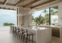
The architect’s fresh spin on mid-century design continues inside, where light-filled rooms, floor-to-ceiling windows and a strong relationship to the outdoors flourish. A neutral palette unifies open spaces that flow seamlessly into each other, punctuated with upbeat colors, natural materials and lux textures. Where shag carpeting once dominated the interior, slate and wood flooring now ground white-walled rooms enlivened with leather, mohair, velvet and performance fabrics in exuberant hues ranging from admiral blue and lime to tangerine, turquoise and citron. “This is a young family and they like vibrant things,” Godwin explains. Period furnishings and striking light fixtures add sculptural forms that similarly animate the home and enthusiastically nod to its mid-century roots.

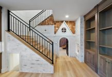
The interior is rife with lively gestures. In the entry, located between a step-up living room and a sequence of opens spaces including the dining, kitchen and family room areas, Godwin fashioned mod see-through panels that serve not only as stair railings and a floor-to-ceiling screen, but also as functional art. “I wanted something spectacular for this main stairway,” he says. Mission accomplished. Memorable design statements continue in the dining room where a dazzling starburst chandelier hovers above
a bronze-based table, in the kitchen where ribbed profiles detail white oak cabinets and in the breakfast room where white stone shelves float across a fireplace clad in metallic brick.


The thrills continue beyond the main level. Upstairs, a master suite features a sculpture-like fireplace wall integrated into a tile-clad monolith that extends from the living room below. Floor-to-ceiling windows frame it on both sides, and stained ipe wood accentuates the sloped ceiling above. “It’s another reference to mid-century,” Godwin explains.

In the playful lower level, aptly coined “the rec room,” tropical-patterned drapes, brightly colored performance fabrics and curvy furnishings rouse the laid-back hangout that features adjoining bar, dining and TV-viewing areas. Broad glass doors open to the pool and patios while the level’s original terrazzo floor—restored by European Marble & Granite—gleams brightly underfoot.

From the bold architecture to the compelling, colorful interior, it’s clear that the swanky style of decades past drove much of this dwelling’s dynamic design. But as Godwin is quick to point out, this is no museum piece. “No one actually thinks this is a mid-century home, but they recognize its spirit,” he explains. For his clients, that’s a large part of why they’re delighted to call this inspired house their home.

For more House Tours, click here.


