A talented team (including Ashton Klomp Interiors, McEwan Custom Homes, architect Joe Carrick of JCD Homes, Northland Design Group and more) forges a magnificent family getaway in the mountains of Midway.
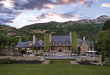
Pastures sprawl in front, the Provo River flows in back and alluring design delights at every turn. Lynn and Susie Kershaw’s handsome Midway home knows how to impress, yet that’s the last thing it was created to do.

“Lynn and Susie simply wanted to build a mountain family retreat, a place where they could gather with their children and grandchildren to create special moments and memories,” says interior designer Christy Klomp. She and design partner Kathryn Ashton teamed with McEwan Custom Homes’ Matt McEwan and Devin Dye to deliver this and more.

From the beginning, Susie favored a light-and-bright coastal style, while Lynn preferred something more rustic. The phrase “modern farmhouse” was bandied about early on, but the designers rejected this of-the-moment style. Instead they responded with a traditional heritage farmhouse characterized by time-honored mountain materials, inviting spaces and a timeless décor that reflects the home’s pastoral setting, yet feels fresh, light and blissfully lived in. “It was a balancing act, a push and pull throughout the project,” Ashton says.

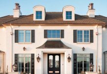
Case in point: the front entry. In keeping with Lynn’s craving for rustic mountain elements, the home’s exterior features rugged limestone, peaked rooflines and hefty beams. Typically, a mountain home’s entry would boast dark, vaulted timbers framing a massive wooden door. Here, however, the beams are arched and light toned, the door is glass and the entry is spanned by an expansive, arched wall of steel-framed windows. Mountain views flow directly from the back of the house and through the interior to this transparent entrance. “Here and throughout the home, we took traditional elements and executed them in contemporary ways to create a fresh, timeless style,” Klomp explains.

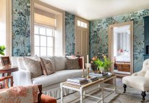
Inside the home, warm shades of light greige, mixed wood tones and accents of varied blues create a palette that flows seamlessly throughout the interior, creating a comforting sense of continuity.


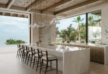
The painted finish that enriches the kitchen cabinets recurs in a number of the home’s bathroom vanities.
The study’s deep gray-blue wall color reappears on the side entry’s dutch door and the limestone that dresses the entry and pantry floors forms hand-carved accent tables. The list goes on. “Repetition creates harmony and makes the décor feel effortless,” Klomp points out. So, too, does layering, something Ashton and Klomp masterfully executed.

“Layers create a comfortable, lived-in look,” Ashton explains. There are plenty to go around: a Hermès throw casually folded across a leather stool, a rustic cowhide laid atop a traditional area rug, a tray of collectibles placed on a linen-draped console and a group of faux tortoise shells displayed across a handsomely paneled wall. They all contribute to the collected, uncontrived look that defines the décor. “The goal is to make it look effortless,” Ashton explains.

“We work hard to make it look like we didn’t,” Klomp says with a laugh. Lighting, too, is layered. Chandeliers shimmer from above while art lights illuminate original paintings, sconces warm walls and table lamps create pools of light across consoles and cozy lounge chairs. “We actually prefer not using can lights in a room,” Klomp says. “Layers of light are much more comforting and beautiful.”

While the design is undeniably beautiful, it is above all functional—a must for the homeowners. “We have a very large family—four daughters and 12 grandchildren,” Susie explains. The floor plan offers spacious areas like the high-ceilinged living room and an open kitchen to accommodate large family gatherings.

Meanwhile, more intimate spots like the study, loft, dining banquette and master suite provide cozy, comfortable retreats for Lynn and Susie when they are alone. Many rooms also serve multiple functions. The craft room, for example, is one of Susie’s favorites and doubles as her office, as well as a playroom and reading lounge for her grandchildren. Lynn’s office is part of the study that also serves as a comfy lounge replete with a fireplace, coffered ceiling and blue-gray walls. “No space in this house goes unused,” Ashton says.

Practicality also flourishes. “This is not a precious, look-but-don’t-touch home,” Ashton says. The fabrics—luxe linens, velvets, chenilles and mohairs—may look refined and fragile, but they’re not. “Many are durable blends and nearly all are treated for stain resistance,” she adds. In the dining area, the designers covered the chairs with washable linen-look slipcovers and upholstered the seats beneath in vinyl.

Wool carpets and rugs run throughout the house providing both elegance and easy care. “Wool is not only lovely, but it is also durable, stain repellant and easy to clean,” Klomp explains. Again, it comes back to a balance. “The rooms not only look beautiful, but they are also easy to live in,” she adds.


While the house was built to serve as a family getaway, the owners intend to make it their primary residence. “Everything about this house speaks to us,” Susie explains. Of course, nothing would make the designers happier than having the Kershaws nearby. “They began as our clients, but they quickly became our friends,” says Ashton. “We’re thrilled that we could help create a special place that they will soon call home.”
Photos by Chris Luker
SOURCES:
Interior Design: Kathryn Ashton & Christy Klomp, Ashton Klomp Interiors | @ashtonklompinteriors
Contractor: Matt McEwan and Devin Dye, McEwan Custom Homes | @mcewancustomhomes
Architect: Joe Carrick, JCD Homes| @jcdhomes
Lanscape Design: Jeremy Fillmore, Northland Design Group | Facebook @NorthlandDesign
Cabinets: Craig Veenker, Cottonwood Cabinets | @cottonwood.cabinets


