In Holladay, traditional and modern find common ground in a beautiful family home.
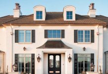
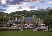
When guests arrive at this home in Holladay, they’re greeted by stone-pillared gates, manicured gardens and stately architecture that exemplifies symmetry with a capital S. The impression of time-honored formality and upper-crust propriety prevails. But as visitors step inside the front door and move deeper into the home, the exalted effect of the facade’s grandness all but disappears. Ties loosen and postures ease as the design moves from graciously formal up front to comfortably familiar farther back.

That’s exactly as the owners and the talented team that designed, built and decorated the home intended.

Sunlight streams through the painted banisters of the entry’s open, two-story staircase, filling the traditional space with glorious light. The paneled walls are white, the oak floors are dark and the look is fresh and welcoming. Elegant, yes. But fussy? Not here. Not for this family.

“This is not a showpiece; it’s a house that is used and enjoyed,” says interior designer Catherine Goodsell, who worked closely with the homeowners to create a timeless family home that caters to their active lives and easygoing style.

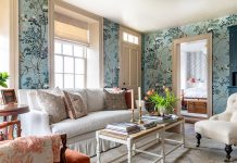
Naturally, oversized blue flowers bloom profusely on the walls in the nearby dining room. “Anyone who knows my client gets this bold and playful choice,” says Goodsell of the Phillip Jeffries wallpaper. “This is so her.” Not only did the surprising choice reflect the homeowner’s fun-loving style, but it also drove the palette for the rest of the home, where a thread of blue moves throughout.

For proof, one only needs to look across the entry into the formal living room. There, inky-blue pillows and boldly patterned armchairs animate the room’s neutral palette and strict symmetry. Even the white draperies are edged in navy.

“It prevents the panels from disappearing into the walls,” says Goodsell, who painted the walls of the more formal spaces white and tinted the others slightly darker for a more casual vibe.

The living room is dressy, but it’s also inviting—a must for the homeowners. They also desired beautiful crown moldings, coffered ceilings and lots of light.

This space checks all three from the wish list. It also showcases the interior’s compelling pairings of contemporary and antique furnishings, assorted metals and woods, straight and elegantly curved lines and smooth and richly textured fabrics. “It’s an eclectic, personalized mix that delivers interest and depth throughout the home,” Goodsell explains.

The symmetry and elegance that defines the more formal entry and front rooms give way to more relaxed design and details farther back. In the kitchen, for instance, Walker Zanger terra cotta tile and Circa metal-shaded pendants inject pattern and warmth. Across the room, walls of windows and a ceiling dressed with beams and shiplap give the breakfast space the look and feel of a charming, enclosed porch. “It makes it more cozy,” she says.

In the adjoining family room, the designer displayed a gallery’s worth of framed mirrors above a nubby-upholstered sofa and furthered the “earthiness” with a rustic carved armoire and bronze-and-opaque glass chandelier. Slightly darker walls, reduced trim and at-ease furnishings help give all three spaces a more casual, come-as-you-are look and feel. “This is one of our family’s favorite gathering spaces,” the client says.

Not that there is a shortage of comfortable spots for family and friends to hang out. “Our architects good-naturedly laughed at the number of family room spaces we wanted,” says the homeowner, referencing the basement TV room, a sunroom, an above-the-garage playroom and handsomely furnished patios, to name a few. “We’ve often had the kids and their friends in all of these spaces at once,” she adds.

The more private spaces live upstairs. The owners wanted the master bedroom—a tranquil, pale blue retreat that opens to a view-laden upper patio—to be on the same level as the children’s ensuite bedrooms. The exception to second-story bedrooms is a guest suite that sits a stone’s toss from the stream at the back of the wooded property.

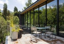
“We wanted the guest room to be on the main level for privacy, and also wanted the option for my husband and me to move down to the main floor some day if we decided to,” the homeowner says. The guest suite’s wooded site inspired a modern-mountain décor defined by warm woods, dark beams, contemporary forms, luxe leather as well as plaid and textured textiles. A handsome canopy bed completes the chic retreat.

“We joke that we’re going to take a vacation to our guest room because we love it, especially with its back porch located right next to the stream,” she adds. Thanks to the talented creative team that the owners refer to as amazing, the sense of comfort and ease seems to resonate through this and every other space in the house.
Want a look at other homes in Utah? See more House Tours here.
Sources
Interior Design and furnishings: Catherine Goodsell, Catherine Goodsell Interiors, Holladay
Architect: Steve Vanze and Wayne Adams, Barnes Vanze Architects, Washington DC
Contractor: Lance Howell, The Biltmore Co, Holladay
Landscape design: Mike Kaiser, Kaiser Trabue Landscape Architecture, Nashville, Tenn.
Garden Design: Heidi Brewer, Empress Garden Design, Holladay
Landscape installation: Eschenfelder Landscaping, SLC


