“The minute we saw the tennis court, we were sold,” Coco Petersen says. She and her husband Ryan were hunting for a new family home in Holladay when they came upon the large, tree-shaded property. “Before committing, we thought we should probably look at the house too,” Coco adds with a laugh. What they discovered was a traditional, 30-year-old residence defined by a red-brick exterior, arched windows, a grand “Gone-with-the-Wind” entry, a segmented floor plan and an outdated décor. Beneath it all, the couple recognized the house’s “good bones” and pondered its potential to become a forever home for their large, active family. “We loved the lot but wondered how to make this house work for us,” Ryan recalls. The couple recruited designer Anne-Marie Barton to evaluate the estate and assess its possibilities.


“The property did the talking,” says Barton, referencing the creekside site, its mature trees and must-have tennis court. “It was a done deal.” The designer also discerned promise in the house—its steeply pitched rooflines, gracious ceiling heights and sprawling main level. “I was asked to discuss a partial redo, but that quickly grew into a complete remodel including both the interior and exterior,” she explains. Collaborating closely with the Petersens, Barton and her associate Wendy Smith teamed with contractor Jackson & LeRoy and Highland Group Architecture to reimagine and renew the family home.


Today, the cedar-shingled, painted-brick home’s squared-off windows, exterior shutters, diamond mullions and limestone accents convey a fresh, European flavor that’s both welcoming and timeless. The house retained a stately presence, but any sense of formality ends at the entry’s white-oak French doors. Beyond the threshold, an open, light-filled interior draws visitors into family-friendly spaces brimming with clean-lined, casual charm. “The overall design signals traditional, but the modern nature of the elements and their execution creates a fresh, traditional style that’s informal and intimate,” Barton explains.
The Petersens savor Barton’s attention to detail—a rubbed brass door handle here, a masterfully curated art wall there—as well as her rejection of all things fussy or fancy. “We’re a large and messy crew that lives casually and comfortably,” Coco explains. Barton embraced the family’s relaxed lifestyle and simple-style preferences while elevating the home’s look and livability at every turn. Beautiful white-oak floors, for example, suit the active household. “Their light natural tone and wire-brushed finish is perfect for kids and pets,” the designer says. Open marble shelves provide big style and easy-to-reach storage in the kitchen, a plush sectional delivers informal seating to the inviting living room and a small breakfast table offers a secondary spot to dine in the keeping room.


A newly opened floor plan similarly serves the Petersen clan. “The original floor plan was very traditional in nature with many smaller, broken-up spaces,” recalls Jeremy Jackson, principal of Jackson & LeRoy. The team opened the main-level spaces, allowing the living, dining, kitchen and keeping room areas to flow freely into each other. “We needed to create a family communal environment,” explains Barton, who designed a stunning kitchen to anchor the open spaces. “This new central kitchen is now the heart of the home,” Jackson says. Memorable features make the space as practical as it is pretty: handsome double islands supply work space and ease traffic flow, beautifully painted cabinetry melds integrated appliances with a built-in hutch and buffet and a large quartzite slab backs a custom range hood. “The all-brass hood was a must,” Barton says. “Its shape is modern, but the material is more traditional.”


Barton also added architectural details and layered engaging materials to help ground the light and airy spaces with a sense of history and substance. These range from paneled walls and built-in bookcases, to chamfered beams, natural brass hardware and a limestone mantle—all choreographed to deliver scale, dimension and a feel of polish to the décor.


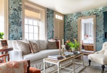
A feather-light palette delivers accents of color that move freely from space to space without detracting from the interior’s sense of calm. Cool blues and greens in the entry, for example, harmonize with sunny gold-and-fawn-toned draperies and pillows in the keeping room. Upstairs, chalky pinks and warm creams charm a girl’s chirpy bedroom. “I knew this house wouldn’t be a sanctuary environment,” Barton says. “There would be soccer equipment and busy living here, so I added color.” Walls painted cream with a hint of gray bring it all together. “The color is both cool and warm,” the designer says.


Reflecting on the home now, Coco exclaims, “We couldn’t be more thrilled. This is our forever home.” Splendid grounds, a welcoming house and lovely, open living spaces that allow the active family to flourish: this is long-term perfection. “I am not leaving this place; you’ll have to cart me out,” Ryan says. Okay, but in the meantime, who’s up for a game of tennis?

Discover more exquisite Home Tours here.


