There it was: a private six-bedroom ski-in/ski-out home nestled in towering pines with jaw-dropping views of Deer Valley and beyond. To onlookers, it appeared a piece of mountain-living paradise. What more could a young family want in a vacation home? Something more livable and up to date, actually.


“It was stuck in the ‘90s,” says McKenzie Dickson, senior designer with Denton House. “It had good bones, but it was outdated and not functional for the family.” With the exception of a recently renovated kitchen and main-level living area, the multi-level, 8,800-square-foot house featured floor after floor of spaces dressed in tired details and heavy, orange-toned timber bearing down on the décor at every turn. “It just felt heavy, bulky and closed off,” Dickson explains.

Undeterred, the new homeowners were seduced by the home’s mountain-top privacy and breathtaking views. They also recognized the home’s Cinderella-like potential, so they hired Dickson and contractors Jackson & LeRoy to transform the house into a modern, light-filled retreat with inviting, comfortable spaces that cater to their active family of five.
“We walked each of the home’s four floors with the owners and discussed how they wanted each to function and feel,” Dickson recalls. Because the owners liked the freshly decorated look and feel of the recently remodeled kitchen and main-level living area, these spaces inspired the re-do of the rest of the home. “They wanted the light, modern style of these rooms throughout,” Dickson says. The team obliged with a plan that eliminated bullying wood elements, unwanted spaces, orange-stained accents and outmoded features. “It’s a great transformation of an outdated ski-lodge style home,” says Jeremy Jackson, principal of Jackson & LeRoy.

The results are evident the minute you step through the front door. Originally a lackluster landing space, the entry now showcases forest views and loads of natural light, courtesy of a new custom door teamed with a generously sized side window. “Privacy is not an issue, and the space needed more light,” Dickson explains. A newly paneled accent wall animates the space with dimension and a gray hue drawn from colors in the living room. A completely overhauled staircase connects these spaces as well as all of the home’s multiple levels.
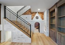
“It unifies the interior,” says Dickson, describing the revamped staircase. Once beefy and all-wood, the four-level feature now boasts white-painted newel posts, thin metal balusters, refined handrails and open treads of white oak. “Updating the staircase made an enormous impact,” the designer says. So too did removing the walls’ troweled plaster, painting stained trim white, replacing dark wood doors with lighter versions and continuing rift-sawn white oak floors throughout the home. “The clients wanted a contemporary, refined look, and these changes helped deliver it,” Dickson explains.
To flesh out the interiors, the designer followed her clients’ lead and chose light, neutral wall colors that vary slightly from floor to floor. Exceptions were made for the kids, who made more colorful choices for their own digs. The understated backdrop is a perfect foil for Dickson’s vivid tones, unfussy forms, luxurious fabrics and custom furnishing scaled to fit the mountain home’s voluminous spaces.

In the lower-level great room, for example, she upholstered two custom sofas in deep blue velvet and cleverly placed them back to back to enable the family to comfortably watch movies or sit in front of the fire. Jackson & LeRoy raised the low ceiling as much as possible and fashioned beams to hide structural supports inside. On the poorly functioning bottom level, they eliminated a closed-off theater room and one of two bed-and-bath combinations to make space for an expanded game room furnished with a rust-toned sectional, large cowhide ottomans and a high-style secondary kitchenette. “The owners didn’t want to have to trek upstairs to get a snack or drink,” Dickson explains. Nearby, a handsomely outfitted bunk room and updated ski room amplify the level’s luxury-meets-livability design.


As so often happens with winning renovations, this project’s success led to changes beyond those original planned. “The owners loved the results so much, that they decided to update the exterior to keep pace with renewed interior,” Dickson says. Today, the revamped home—indoors and out—gives the owners as much pleasure as do the views and mountaintop setting that inspired them to purchase the house in the first place.
Click here for more house tours.


