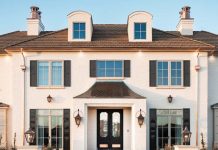
Set back in a quiet Millcreek neighborhood, Establish Design envisions a new house appears long-established in its tree-shaded landscape. Its stone and clapboard facade, simple symmetry and two-story form epitomize Colonial-style architecture. And while its traditional roots date back centuries, its design was fueled by the present.
Photography by Savannah Buswell


“Our clients wanted a timeless, traditional home that functions for modern living and entertaining,” says architect Bradford Houston. He teamed with Establish Design principals Elizabeth Wixom Johnsen and Kimberly Rasmussen and contractor The Fox Group to create exactly that for the young active family.


The architecture, featuring clapboard-wrapped wings that step out into gardens designed by Emily Brooks Wayment, convincingly suggests an original stone house with additions attached over the years. “The mix of materials creates the impression the house has evolved over time,” Houston explains. The central stone building’s symmetry, arched portico, Chippendale railings and copper accents deliver a buttoned-up persona. The attached garage, on the other hand, features clapboard siding and a gambrel roof that convey a more relaxed style. “It’s a perfect combination that makes the house look and feel so settled,” says Johnsen, describing the Colonial-style home’s stone massing as Georgian and the garage wing as Dutch.


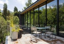
Capturing the essence of the classic architecture, the interior is, above all, about light, Johnsen explains. “This family exudes a beautiful light, and we wanted to create a place of light for them.” From the front of the home, symmetrically placed and traditionally proportioned windows draw light into front rooms through timeless tracery. Toward the back of the home, light pours through similarly detailed windows and doors clustered in a more modern fashion. “This opens the house to more light and views through large expanses of glass while maintaining a traditional look and feel,” Houston says.


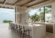
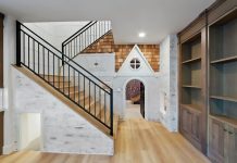
A modern-day floor plan similarly twists tradition. The front door opens to an understated entry flanked by a music room and a wood-paneled study. This balanced arrangement furthers the symmetry established by the exterior. Surprisingly, though, there is no statement-making staircase. “We moved it to the side of the house to create a beautiful stair hall that connects the three levels,” Houston says. He performed a similar sleight of hand by merging the traditionally separated living room, family room and kitchen areas into an open great room devised for modern living and entertaining. “In the old days, these might have been split by a hallway,” Johnsen explains. Here, the entry looks directly through the center of the open space to a wall of French doors and windows overlooking the landscape. “In this home, you come in and it opens up, exploding with light and space,” Johnsen says.


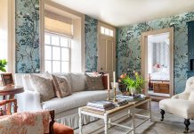
The designers allowed natural light to flow freely through windows, washing across warm-white walls and timeless trim and millwork. “This is a heritage house, so the white had to have a little cream to age it,” Johnsen explains. The designers added “watercolor” hues to shape a cohesive, cheery palette that doesn’t feel old or stodgy. “Our clients wanted light and airy and craved soft colors.” Johnsen explains. As if pulled from the gardens, hushed aqua cools the kitchen’s quartzite, pale blue soothes the primary suite and pastel pink tints a quaint window seat. “We used lighter tones in the more formal living areas and deeper colors and bolder patterns in more casual spaces, including the family room and lower level,” Johnsen explains.

Underfoot, soft carpets invite barefoot moments on medium-toned oak floors, while arched portals, coffered ceilings and artfully arranged furniture define and choreograph spaces throughout. The designers filled the house with carefully wrought details, giving each space a charmed quality. In the stair hall, for example, handsome wainscoting mimics the lines of the handrail as it moves from the top floor down. In the dining/conservatory room, deep coffers deliver dimension to the stained tongue-and-groove-ceiling. Blue-painted windows accentuate the office’s warm cherry walls, built-in cabinets create a window portal for a bed in a main-level guest room and at the end of an upstairs hallway, a footed tub creates a memorable focal point.


The result is a new home with old soul. “It is very classic in its detailing yet very relaxed and livable by virtue of the floor plan and architecture,” Johnsen says. Thanks to the talented team, the family lives in the now while surrounded by a stylish sense of the past.

Discover more projects by Establish Design here.


