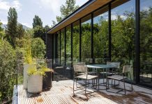
In an Orem landscape remodel, pros from Northland Design group convert a steeply sloped site into a series of terraced gardens and outdoor living areas that are as remarkable as the property’s freshly remodeled house.
A hilltop site may seem like the perfect spot to have a house, but steep slopes and dramatic drop-offs are hardly ideal conditions for livable landscapes and glorious gardens. Case in point: this ‘80s Orem home, which backs onto a ravine with the Provo River flowing below.

During the home’s recent renovation, architectural designer Steve Tiek asked landscape designer Ryan Talbot to give the timeworn half-acre property an overhaul that would complement and enhance the masterful remodel Tiek and designer Ali Henrie created for the dwelling. Talbot, principal of Northland Design Group, was eager to dig in. “At first glance, the challenge was typical—beautify and update,” he recalls. “Just as I was getting comfortable, the clients showed me the backyard and pointed to an unused, very steep 20-foot drop-off and said, ‘We want to use this space as a garden and for more gatherings.’ That’s when the challenge turned from typical to insane.” In addition to this formidable 60% slope behind the house, the entire property presented obsolete plantings and hardscape features that also required a major revamp.

Tiek, principal of Tiek Design Group, transformed the home by giving the original ‘80s brick house an updated European look and feel. Working with Henrie and contractor Carl Robison, he filled the bricks’ deep pointing and painted the semi-smoothed facade a light cream hue that boldly contrasts with its dark shingled roof. Tiek also opened the entry by cutting back its oppressively low roofline and inserted an overhead pergola to heighten and brighten the space. New doors, windows, lanterns, garage doors and other striking features team to update the dwelling. The lackluster landscape demanded similar attention.

“The original front yard was nothing to write home about,” recalls Talbot, who used Tiek’s preliminary drawings and the house’s fresh European style as a starting point for his design. “A French country style usually translates to a more organized design, more symmetry and a greater sense of age,” he explains. To that end, Talbot extended low walls away from the entry to create a spacious courtyard that fosters a sense of balance centered on the double front doors. Lantern-topped posts, potted topiaries and a wide, garden-bordered walkway connecting the curb to the front entrance accomplish the same. But that’s where the symmetry ends.

Before 
After
“Except for the entry, the house is very asymmetrical,” Talbot explains. He embraced this imbalance, renewing the driveways on the right side of the front yard with paver-bordered, sandscaped concrete while installing an informal path of crushed granite left of the centered entry. This freeform walkway leads to the side yard, where an eye-catching, lantern-lit gate performs as a welcoming portal to the dramatically transformed yard behind the home.

“Usability drove the design,” explains Talbot, who created an impressive stone stairway that leads from the gate to a crushed-granite path below. “Unfortunately, side yards are often overlooked, but they provide the opportunity to continue telling the design’s story,” he says. The granite path connects to a broad lower patio that opens to the reimagined landscape below. There, Talbot removed overgrown junipers covering the “massive hill” and worked with the land’s steep contours as he manipulated its grade for planted terraces, waist-high retaining walls and the base for a limestone stairway, all crafted from dry-stacked ledge stone topped with a stone cap. “Unlike bulky, busy-looking boulder walls, these are more space efficient and have a more aged, European look and feel,” he explains.

Before 
After
The spectacular ledge stone hardscape enabled Talbot to create features and outdoor living areas the homeowners craved: a raised vegetable garden, confined lawns, a children’s play area, a rose and perennial garden, a raised deck that floats over the views and a meandering stone stairway that descends from one level of the yard to the next. It ends at a lower patio anchored by a raised firepit and surrounded by the sights and sounds of the nearby river.
Taking an enormous challenge in stride, Talbot aimed to “take advantage of the hill,” transforming the once useless slope to a lush and livable extension of the home. On all levels, the homeowners relish and use this and every part of their formerly lackluster yard.

Explore more landscape design here.


