Written by: Natalie Taylor | Photos by: Scot Zimmerman
When designer Robert Brain hears the adage “Those who live in glass houses shouldn’t throw stones,” his ears perk up. Not because he’s one to disparage others but because he actually lives in such a home.
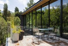
Located in one of the oldest neighborhoods in Salt Lake City, Brain’s abode is a rare find. Crafted in the International style, it follows in the footsteps of Ludwig Mies van der Rohe’s Farnsworth House and features modern materials such as steel and glass that enclose and define its austere but elegant spaces. While many folks may not recognize the architectural significance of this home, Brain—owner of the design firm BRAININCORPORATED—does.

Brain, a designer with sublime sensitivity, has worked his magic for a number of clients and firms including the O.C. Tanner Company, the Cliff Lodge at Snowbird, and an assortment of restaurant, hospitality, and commercial projects across the globe. He worked on and off for 20 years at Salt Lake’s Clark Leaming Co., beginning as an intern, then working as an assistant to co-founder Merline Leaming before serving as vice president and director of design. He opened his own firm in 1990, focusing on residential interiors for clients nationwide. His appreciation for his unique house stems from experience and knowledge, as well as fond childhood memories.

Brain remembers as a youngster walking two blocks across horse pastures to visit his Aunt Geba and Uncle Ralph in their little glass house. “They tended me so often, I essentially grew up in this house,” he says. In fact, the dwelling is so deeply rooted in Brain’s family, it’s almost a member.
In 1952, Brain’s cousin, architect Jack Smith—along with architect John Sugdon, who had been an assistant to Mies van der Rohe while he was teaching at the Illinois Institute of Technology (IIT) in Chicago—designed and built the glass house.

But eventually, Brain’s aunt and uncle sold the home. Brain moved to New York City to attend the Parsons School of Design, earning a tri-major in landscape, interior, and product design as well as a bachelor of fine arts from The New School for Social Research.
When he returned to Utah, Brain was delighted to discover that the glass house was on the market and went to see it. “I was distraught by how destroyed it was,” he says. “The previous owners had no idea what it was, and I was so discouraged that I no longer wanted to buy it.” Over the years, previous owners had made additions that had no relation to the International style and had destroyed the original floor plan.

In spite of its dismal state, the integrity of the house shone through, and Brain decided to buy the dwelling, opting to live in it during the remodel. He proceeded in two steps: addition by subtraction. “I tore down the additions and rebuilt them,” he says. “I’ve lived here now for 25 years, and it’s still not finished.” He employed architect David Richardson and contractor Jeff Ryder of Capitol Hill Construction to help him restore the house. Built on a grid system, the linear structure boasts walls and interior courtyards comprising glass and sliding glass doors that fill the interior with abundant light. Brain’s new construction more than doubled the size of the 1952 house.

Originally, the 972-square-foot dwelling had one bathroom and one bedroom. Now the home spans 2,200 square feet and includes a library, three enclosed courtyards, three bathrooms, and two bedrooms, including a master bedroom that features a fireplace and generous walk-in closet with washer and dryer. From this suite, glass walls open onto a gravel-tiled courtyard adorned with a single granite sphere fountain and bust.
“I open the doors and it’s as if I am sleeping outside,” Brain says. The open floor plan with glass walls and courtyards provides uninterrupted sight lines throughout. “From my master bedroom, I can see through one courtyard, into the dining room and living room, and out into the backyard,” he says. But the bathroom is the crowning glory of the master suite.
There, a custom black granite tub and a chrome shower with black granite walls overlook an enclosed courtyard. Sliding glass doors and large windows open to the patio area, creating the effect of an outdoor shower and bath with absolute privacy. “I enjoy many starlit showers,” Brain says.

With his thoughtful rebuild, the house now represents the Bauhaus school of design perspective that viewed architecture as a synthesis of art, craft, and technology. “Swiss architect Le Corbusier said, ‘A house is a machine for living in,’” says Brain. “What this means is that the house is not indigenous to the landscape. It is a machine that can be lowered into any landscape and be livable.” To make that clear delineation, a 36-inch gravel border surrounds Brain’s house, separating its architecture from its environment.
While Brain insisted on adhering to the architectural integrity of the International style, he wanted expansive options in interior design. “I didn’t want it to be an ode,” he says. “I wanted something trustworthy and faithful. There was no reason that the house had to be entirely set in 1952.” As a result, the décor is decidedly Robert.

Using his keen eye for display, he seamlessly combines unusual objects. “I have a way of mixing styles that aren’t necessarily related but makes sense to me,” he says. “I can find the common denominator between contemporary, Japanese, Chinese, French, and English styles.” He also melds local flavor with collections from Utah artists including Gary Collins, John Collins, Richard Murray, Fred Lyman, John Estes, and Randall Lake. Throughout the home, Brain animated the spaces with artistic displays of rare art collections, original modern furniture, and priceless antiques found on his various travels.
Each piece carries the story of its origin and journey and often serves a functional purpose. For example, a beautiful necklace crafted from Old World coins that Brain found in Capetown, South Africa, is framed in a display box on the master bathroom vanity counter. “I gave that necklace to a woman whom I think of as my soul mother,” he explains. “When she died, she willed the necklace to me, and so I keep it here, in my bathroom, so I can remember her every morning.” A jade Chinese death mask dating back thousands of years is backlit in a niche in the master bedroom. At night, the mask works as an eerie modern night-light.

Iconic furniture from the most influential designers of the modern movement is set off by white walls, white gloss laminate, dove gray concrete floors, and an abundance of reflective surfaces including mirrors and chrome. “I work with colors every day,” Brain says. “So a quiet palette is very restful and calming to me.” Neutral, natural colors such as white and black form a simple background, emphasizing the interior architecture and providing a sense of geometric order.
As a result, the house is serene and quiet, save for the sounds of birds and bubbling fountains in the courtyards.
Brain walks through the lush gardens following a trickling stream he recently created among the granite cairns in the garden. His image reflects in the kitchen’s mirrored backsplash, visible through the transparent exterior walls. The glass structure provides Brain with not only a clear vision of his treasures but a clear sense of appreciation for them as well.


Perfectly Composed
Brain’s tips for creating maximum impact with your collections
-
Rather than displaying a few uniform objects, cluster a large number of pieces in a variety of shapes and sizes to make a greater impact.
-
Group items in an informal pyramid shape with a substantial object near the center. Smaller items can be arranged on either side.
-
Build collections over time. Most people don’t start out with the collections—they find perfect pieces over the years and add to the display.
-
Display an odd number of items together to achieve a natural or organic feel. For a more orderly display, pair even quantities of objects together.
-
Don’t limit yourself to like items. An interesting display can include dissimilar pieces in a variety of colors, sizes, and styles.
For more interior design inspiration, subscribe to the magazine.


