Originally Featured in our Summer 2007 Issue
By: Natalie Taylor | Photography: Scot Zimmerman
There’s no denying it—life means change. Jason and Ashley Boe are a prime example. The couple lived as newlyweds in a downtown, Salt Lake condo that offered oodles of city chic. They loved feeling the urban pulse under their feet, but once they decided to start a family, their needs shifted and they became avid house scouts. “We had been looking for a couple of years,” says Ashley. “Then one day Jason called me and told me he found the perfect place. He made an offer even before walking through the whole thing.” While most folks saw only a 1950s ranch, Jason saw potential.


Jason, a real estate investor and developer with 17 years of experience remodeling buildings, knew exactly what he was looking for—an architecturally striking, city-center home with geometric lines and visual continuity. In this rambler, he found all of this and more. It also came with a mid-century pedigree. “I always ask for any original documentation,” he says. “Usually, people don’t have it. But these owners had the paperwork—including the name of the home’s architect.”


Jason tracked down that architect, Marty Brixon. And although he had since passed away, his business partner, Jim Christopher, agreed to work with Jason during the remodel. “I wanted to keep the integrity of the 1950-style home intact,” explains Jason, “but I also had a very clear idea of what we wanted to create.” He and Ashley desired a pared-down pad that wed the purity of minimalism with warm livability.


For clean freaks like the Boes, minimalist décor makes sense. “I can’t function in a mess,” says Jason, “so, the clean, contemporary design is just a progression of our style.” Ashley agrees. “We’re definitely not knick-knack people,” she says. They’re definitely not slackers either.
The couple did much of the remodeling work themselves. “We hired a contractor in the beginning,” explains Ashley, “but it wasn’t long before we realized it wasn’t going to be easy translating our vision to someone else.” They rolled up their sleeves and dug in—gutting the house down to the studs during the first year of work. The original house was just 2,600 square feet, but the Boes added an entire wing, incorporating another 1,000 square feet.

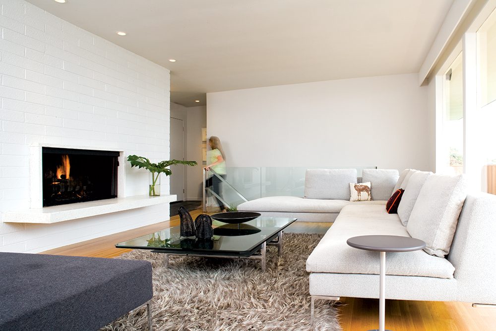
While it retains the original quarter-sewn white oak floors, flat roof, and fireplace, the house is vastly different from the original floor plans. The configuration changed, transformed from multiple small spaces into large expansive areas. Two bedrooms became one master suite. They made over the dining room into an outdoor patio. Now the dwelling hosts four bedrooms and three bathrooms. In addition to the extra space inside, the Boes added outdoor living space by building a deck overlooking the city and spanning the width of the house. They also created an enclosed patio adjacent to the kitchen. These changes created an airy, light-filled home with barely discernible boundaries between interior spaces, as well as between indoors and out.


“To create a sense of openness, we designed the home with large walk-throughs, glass walls, and tall windows,” says Jason. The couple also utilized each square foot to its fullest potential. This is most apparent in the kitchen.
The busiest room in the home, the kitchen houses a number of activity areas. A cozy sitting room just off the cooking area provides a place for the family to hang out while one parent is preparing meals and the other tending to their child. The posh, fitted kitchen by Boffi, with it silky white marble countertops and stainless steel appliances, was custom made in Chicago and installed by Boffi experts who flew out for the job. In keeping with the minimalist mantra, the clean-lined kitchen cabinetry sits square and low. “There are no upper cabinets or high shelves,” says Ashley. “The drawers are easy to access and totally organized. There’s a place for everything and everything has its place.”

The efficient storage that exists in the kitchen runs throughout the house. After all, even though the house is stripped for simplicity, the couple still has stuff that needs to go somewhere. After the Boes moved from their downtown condo, they wisely jettisoned anything that didn’t fit. For those precious possessions that survived the purge, Jason designed a number of über-smart storage units, including a modular closet in the master bedroom and a pantry in the family room that doubles as an entertainment center. He also designed many of the home’s fixtures and furnishings.

With a clear vision of their dream home, Jason whipped out his sketchbook, and drafted elements tailored to meet the home’s exact requirements. He then hired friends at AVM Steel Fabrication to build many of the interior’s stainless steel pieces. They include a bar that serves as a transition piece from the kitchen to formal dining area and shelving for the master bath sinks. The resulting look is tidy and ultrachic.

While the character of minimalism is apparent though out the home— clean lines, hard surfaces, and low sitting form—the Boes introduced natural fibers and unexpected textures to soften the austere look. “We added some personal touches to create a modern home that is still warm and livable—not so cold,” says Ashley. They accented the stark, white walls and black floors with a range of delicious colors–tangerine, lime green, and cherry red. The bold hues ideally suit a dwelling that opts for function over fluff. Even the accessories in their dynamic digs are well-designed utility pieces that double as decorative accents—assorted glassware, bowls, teapots, and salt-and-pepper shakers. In every room, one retro piece, a toaster in the kitchen for example, gives a nod to the 50s.

More than just a mod crib, the house is also a creative workspace. The Boes both work from home—Jason as a real estate professional and Ashley as a national sales manager for Clear Channel Radio. To accommodate their business lives, they created two home offices on separate floors that help delineate home from work. For times when workouts overtake work, a full gym in the basement provides weight machines and equipment for the fit and active couple.


Looking back, the Boes embrace the change that propelled their move from their high rise condo. It not only inspired them to find their ‘50s rambler, but to transform it into the hip pad they now call home.

Featured Image: The brick fireplace and quarter-sewn white oak flooring are the only remaining interior elements of the original home. Bright white walls and low, square furniture are hallmarks of minimalism, but the Boes added texture with a shaggy Flokati rug, mesh accessories, and B&B Italia linen sofas. Tinted windows and a deck run the length of the home and add outdoor living space to the urban setting.


