Think you can’t teach an old dog new tricks? This Sandy home proves otherwise, with its decades-old Tuscan style recently replaced with one more timeless and transitional. Gone are the Tuscan-inspired deep jewel tones, ornate details and dark woods from the early 2000s. As showcased in our feature A NEW LIGHT, the family home is now a statement of fresh, formal elegance and clean-lined, classic style—courtesy of Tri City Construction and Lucca Design. These pros overhauled every inch of the home, as captured by these remarkable before-and-after photos.
After photos by Rebekah Westover
ENTRY
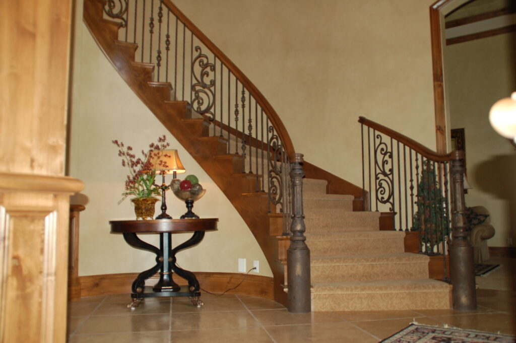

In the entry, the team ditched the travertine floors, dark woodwork, golden textured walls and an ornate stair rail. Today, creamy white walls enriched with custom panels and reeded detailing hug the curved staircase renewed with updated metal railings and a high-style speckled runner.
FRONT DOOR
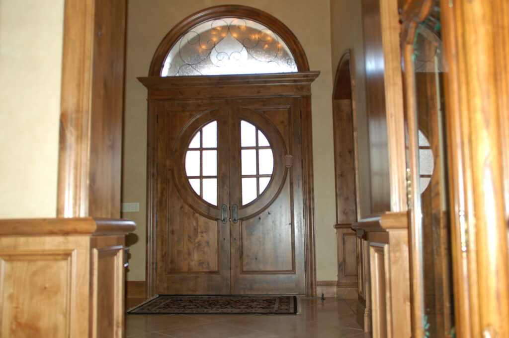

The decor’s lighter, transitional style begins at the new front doors. Say so long to the dark-and-bulky double doors that prevented much light from filling the foyer. Today, guests enter the home through new white-oak doors boasting reeded panels, simplified moldings and large pieces of glass.
LIVING ROOM


To transform the formal living room, the team replaced its Tuscan-style flourishes, including a carved wood mantel, beefy window frames, plantation shutters and golden textured walls. Dressed in cool blue and white, the renewed space boasts fresh white walls, white-oak floors, a new white-oak ceiling treatment, simple draperies and a brand new fireplace.
DINING ROOM
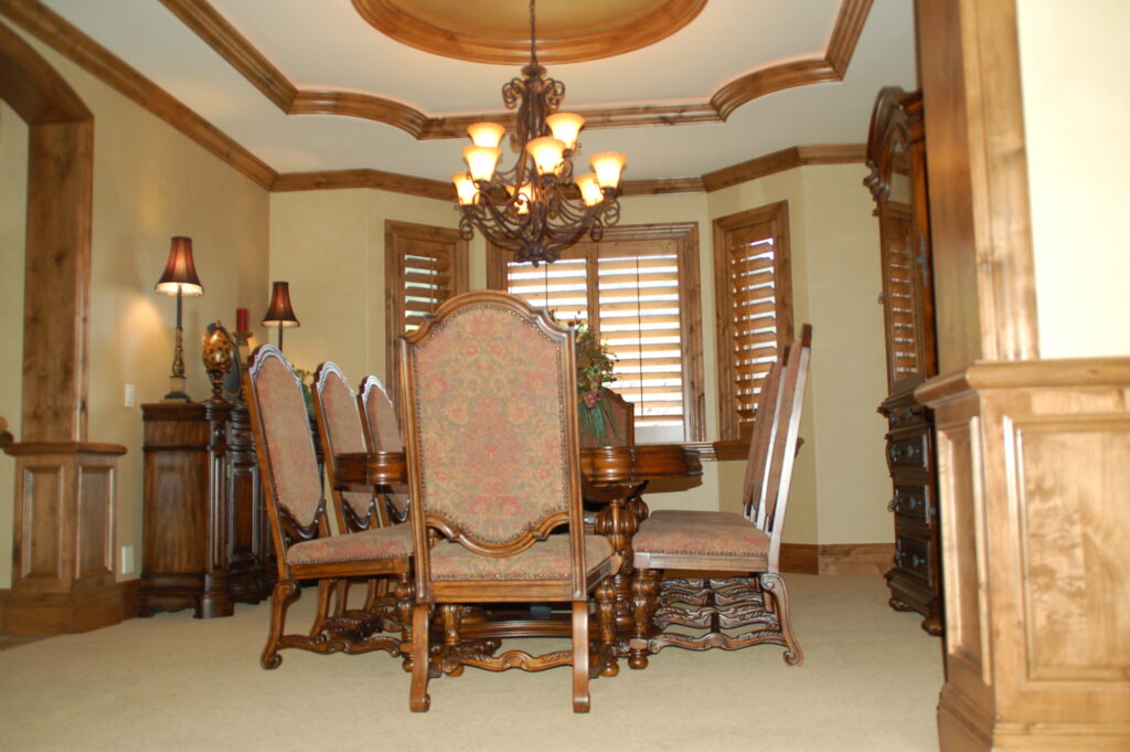

In the welcoming dining room, wainscoting and a simplified coffered ceiling—both painted warm gray—join grasscloth wallcovering to deliver an updated statement of sophistication and transitional style. Simple Roman blinds replace bulky plantation shutters and driftwood-toned furniture stands in for old pieces defined by heavy wood tones and beefy carvings.
POWDER ROOM
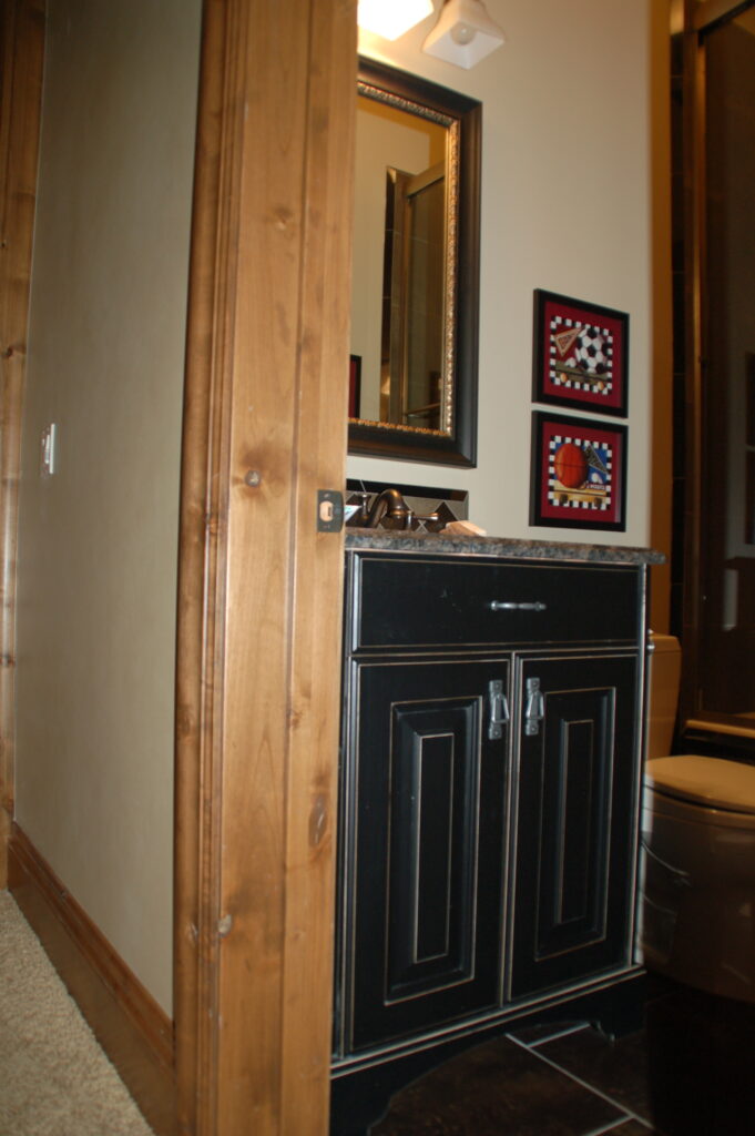

Once home to a black vanity with a distressed finish and a dark granite countertop, the remodeled powder room features satin-brass fixtures, a quartzite countertop and floral-printed grasscloth wallpaper.
OPEN KITCHEN AND FAMILY ROOM

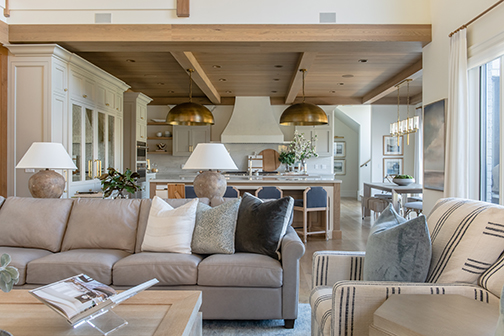
Opening to the family room, the previous kitchen was a mix of heavily carved cabinets, two-level countertops, patterned granite and elaborate embellishments. Today, the freshly fashioned space is defined by a tongue-and-groove ceiling, white oak and painted cabinetry, an understated plaster hood, quartzite countertops and a pair of oversized brass dome pendant lights.
KITCHEN


The team replaced the kitchen’s old appliances and heavy wood paneling. To cleverly disguise the new Sub Zero refrigeration, the designers concealed it behind custom cabinetry embellished with panels of antiqued mirror glass.
PRIMARY BEDROOM


Custom paneling transforms the primary bedroom, sheathing the headboard wall in classic detailing and engaging dimension. The motif is echoed by new oak beams overhead. The ceiling was lowered to make the room feel more comfortable and cozy, the designers explain.
PRIMARY BATHROOM


In the primary bathroom, custom-cut tiles create a lively pattern for the floor. The team removed a bulky undermount tub that was surrounded by tiled steps and ornate tile. Today, a stylish freestanding bathtub, squared-off windows and simplified ceiling detail foster the room’s updated look and an open and airy feel.
LAUNDRY ROOM


The team updated the laundry room with sage green cabinetry and a patterned floor. The cabinets go all the way to the ceiling to simplify the design. Stacked appliances provide more service in less space, and new amenities include a steamer closet, a custom drying rack/ironing board and open shelving for rolling hampers.
See our full tour of this modern remodel here.


