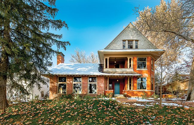
Enduring design and extraordinary craftsmanship distinguish the new kitchen of a century-old Salt Lake City home.
By Brad Mee, Photos by Scot Zimmerman
Step into the new kitchen of this circa 1901 Salt Lake City home and you’ll find it difficult to determine what’s original and what’s not. That’s exactly the intent of the homeowner who hired architect/designer Scott Cornelius and contractor John Ford to expand and remodel the entire Shingle-Style home, giving it modern ease and vintage charm. “The goal was to make the house function better for the family without losing its historic nature,” Cornelius says. With the architect’s down-to-the-details design and Ford’s skillful execution, the homeowner’s objective was remarkably realized.
Photo: The owner favored the 1901 home’s arts and crafts cottage style over its Victorian leanings. Capturing the Shingle style character was “about being honest with the materials and the craftsmanship,” Cornelius says. In the kitchen, the team prioritized a functional floor plan distinguishing the cooking and mingling spaces and linked the room to those nearby with large openings that ease the interior’s traffic flow.

Understated granite and glazed celadon wall tile provide visual relief from the widespread wood of the quarter-sawn oak cabinets. The stain-and-oil finish was favored over paint for its easy maintenance and the richness and sense of permanence it lends the room.

“Glass-front doors give a sense of openness and make the upper cabinets look lighter,” says Cornelius, who describes the feature as common to butler pantries of the era. To enhance the treatment, the team inset tile inside the cabinets creating the illusion that the running-bond backsplash expands upward and behind the cabinet shelves.

The team played hide-and-seek with the pantry by concealing it behind a door of vertical tongue and groove paneling that lines up perfectly with that of the wall. The adjacent refrigerator is completely trimmed out with wood and is designed to somewhat resemble an old icebox.

Forget stainless steel. This ceramic, apron-front farmer’s sink better suits the room’s casual, vintage style. New windows feature unfettered lower panes that frame views while upper portions are broken up to relate to the patterning of the room’s upper cabinets.

Never mind ceilings pocked with countless recessed lights. Vintage Holophane industrial pendants drop from the high ceiling bringing it down to a comfortable human scale while illuminating the kitchen with style. “Hanging fixtures give a better light and relate better to the space,” says Cornelius. Ford created a small apron to conceal under-counter LED lighting that illuminates the tile backsplash. He also installed task lighting over the sink.

The new kitchen, built on site, boasts extraordinary workmanship elevating its quality and character. Notable features include full inset-style doors and drawers fitting exactly within the perfectly square cabinet frames, walls built out to be flush with the cabinets and trim pieces that terminate precisely. “The most challenging and rewarding part of the project was maintaining the high level of detail without missing a single thing,” says Ford.

Featuring a simple design and matte nickel finish, the kitchen’s hardware is so honest that it showcases attachment screws. “Often, overly fussy hardware is used to attract attention when the cabinetry isn’t interesting,” Cornelius says. Here, conversely, the plain handles allow Ford’s furniture-quality cabinetry to showcase his artistry.

Architect and Designer: Scott Cornelius
Contractor: John Ford


